General Discussion
Related: Editorials & Other Articles, Issue Forums, Alliance Forums, Region ForumsEver notice the upside down stars on the GOP logo?
I heard Thom Hartmann talking about this yesterday. I'm not a conspiracy oriented person, and I don't believe in the devil, but isn't it a little weird that the party that capitalizes on the "Christian conservative" vote features upside down, pentagram-esque stars on their logo?
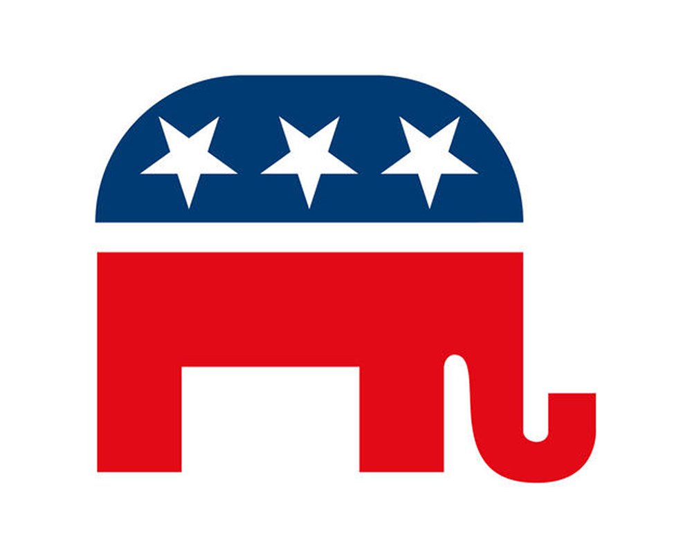
Hartmann claims they flipped the stars in 2000 when W was elected, but there's evidence that the stars were inverted before that:

 = new reply since forum marked as read
Highlight:
NoneDon't highlight anything
5 newestHighlight 5 most recent replies
= new reply since forum marked as read
Highlight:
NoneDon't highlight anything
5 newestHighlight 5 most recent replies

underpants
(182,787 posts)Hell, they dupe their people on everything else so why not that?

PoindexterOglethorpe
(25,851 posts)So there's only one correct way to display a star?
Worrying about just how stars are aligned on something like that, well that's a sign of having too much time on your hands.
liberalnarb
(4,532 posts)
Cirque du So-What
(25,932 posts)That would be the ultimate hallmark of having too much time on one's hands.

lunatica
(53,410 posts)I have too much time on my hands. I’m friggin retired and earned every minute of it! 

MineralMan
(146,288 posts)On the US flag, the stars are oriented with the single point at the top. Some early flags, however, where the stars form a circle, show the stars oriented in all positions.
Here's my guess: someone decided to orient the stars on that logo with the single point down to make it different from the flag. That would have avoided criticism of using flag imagery for political purposes. Since there are examples all the way back to Nixon, I'd guess that was the reason. "See, the stars are upside down, so we're not using flag imagery."
Demit
(11,238 posts)As if they are a chorus line of dancers, standing on one leg, with one leg up in the air.
Things on a slant convey a feeling of movement, a feeling of being more dynamic.
MineralMan
(146,288 posts)However, the star has specific emotional connotations, and failing to consider those can lead to issues.
For most people, however, a star is just a star, in whatever orientation. Most people don't look closely enough at a row of stars to form any emotional feeling, I think.
Some graphic designers fail to recognize the emotional significance of their designs, or are going for one thing and getting another. There have been marketing disasters that have occurred based on missing an emotional element in a design that ended up killing the product. For example, look at this failed Facebook Dove soap ad:

Although unintended, the unspoken racism in the ad killed the ad campaign. The emotional takeaway was "Dove makes you white, and that's way better." Or "Dove washes the brown dirt off." The designer of the ad thought it was clever, but it was an utter disaster. That was in 2017. Search Google for Dove racist, and you'll get tons of results, all leading to that disastrous ad.
Demit
(11,238 posts)A graphic designer wouldn't have been responsible for that Dove ad anyway. Designers don't make marketing decisions. Marketing campaigns are created higher up the agency chain.
MineralMan
(146,288 posts)Someone designed that ad. Someone designs all marketing collateral. I assume someone who considers him or herself to be a graphic designer laid out the ad and created the final version. Who else would do that?
I work with graphic artists, making up the words that go into their designs. Most often, between the two specialties, we're the ones who propose specific marketing collateral. I also work with a web designer, and SEO expert, and others. But someone has to design the pages. That's a graphic design thing. Everyone has input into it, but the actual design gets executed by a graphical designer.
Demit
(11,238 posts)I believe the image you posted was a still from a short video. That would have been art-directed. The art director would have chosen the models & supervised the shoot. A graphic (not graphical) designer wouldn't likely have been involved with this project at all.
Please, don't tell me my field.
MineralMan
(146,288 posts)In my field and the company for which I'm the content director, everyone plays a role in design, including a neuroscientist. I'm not an artist, but I have input into design. The artist is not a writer, but comments on copy. The owner of the company is a neuroscientist and has comments on everything from his perspective. We also rely on an SEO professional and website producer.
Please, don't tell me my field.
Demit
(11,238 posts)I don't know what your field is, so I couldn't presume to tell you it. But I know mine, and I'm afraid it's evident that you don't.
I think that's about all there is to say on the subject.
lunatica
(53,410 posts)What else could the message be except racist?

Girard442
(6,070 posts)Besides, Kushner once had part-ownership of 666 5th Avenue and the Evangelicals were cool with it, so even if it were a Satanic symbol, IOKIYAR.

Orangepeel
(13,933 posts)
Power 2 the People
(2,437 posts)
LunaSea
(2,893 posts)

customerserviceguy
(25,183 posts)but it seems to me that the curves on the front and back of the upper part of the elephant might be dictating the placement of the outside two stars (each of the outer three points is somewhat equidistant from the line of the curve), with the center star simply oriented the same way for continuity.
People see what they want to see. I remember the Amway people putting out the nonsense that the Proctor and Gamble logo had thirteen stars because it was a Satanist company. Turns out, it is in respect of the original thirteen colonies which became the first states.
I had an opportunity at game night last night to tell about my fourth grade teacher telling us about a diabolical Communist plot to defile JFK (this was in about 1965) by putting a hammer and sickle on the thin neckline of the bust of JFK on the half-dollar coin. My nine-year-old mind regarded this as truth until I found the actual answer, the initials of the coin's designer, Gilroy Roberts, were used in a stylized way that caused some people wanted to see the sign of the Communist party, especially when they were fed nonsense.
If the worst thing about the GOP were their logo, we wouldn't have half the problems that we do in this country.