Hey, did anybody see this presidential income/tax rate graph?
[div class=excerpt style=background:#AFEEEE]Putting Romney’s tax returns in presidential context
by Lee Drutman
July 25, 2012, 10:54 a.m.
The controversy over what’s hiding in Mitt Romney’s unreleased tax returns continues. But even without the missing filings, putting his 2010 and 2011 tax numbers in context is strikingly informative. It dramatically shows what an outlier Romney is on a few basic tax and income dimensions.
Figure 1 plots effective tax rate and adjusted gross income on all the recent presidential tax returns we could find, including Romney’s 2010 and 2011 returns (we consulted the Tax History Project for original returns and we standardized the data here).
Figure 1. Income and Tax Rates
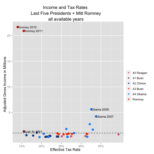
This scatter plot highlights two things: First, the two highest income years we observe are Romney 2011 ($21.6 million) and Romney 2010 ($20.9 million). Nobody else comes close. The next closest are Obama 2009 ($5.5 million) and Obama 2007 ($4.1 million).
Second, the two lowest effective tax rates we observe also belong to Romney. The 2012 Republican candidate paid an effective tax rate of 13.9% in 2010 and 15.4% in 2011. Next lowest is George H.W. Bush, who paid a 15.5% rate in 1991. By contrast, in Obama’s two highest earning years, he paid a rate of 32.6% (2009) and 33.7% (2007).
<more>
http://sunlightfoundation.com/blog/2012/07/25/putting-romneys-tax-returns-in-presidential-context/