Welcome to DU!
The truly grassroots left-of-center political community where regular people, not algorithms, drive the discussions and set the standards.
Join the community:
Create a free account
Support DU (and get rid of ads!):
Become a Star Member
Latest Breaking News
General Discussion
The DU Lounge
All Forums
Issue Forums
Culture Forums
Alliance Forums
Region Forums
Support Forums
Help & Search
General Discussion
Related: Editorials & Other Articles, Issue Forums, Alliance Forums, Region ForumsMyth and Reality: The Low-Wage Job Machine
Myth and Reality: The Low-Wage Job Machine
In the wake of the July employment report released last week, an interesting graphic appeared in a Wall Street Journal article with the somewhat distressing title "Low Pay Clouds Job Growth." The graphic juxtaposed average wages by sector (as of July 2013) with changes in the numbers of jobs created by sector (from July 2011 through July 2013). I've reproduced that chart below, with a few enhancements:
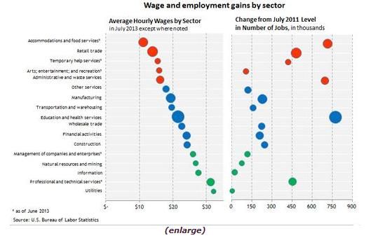
For the 17 sectors, the red circles represent the five sectors with the lowest average wage as of July. The green circles represent the five sectors with the highest average wages, and the blue circles represent those with average wages between the high and low groups. The size of each of the circles in the chart represents the share of employment in that sector during the July 2011 to July 2013 period.
The clear implication of the article is that things are even worse than you think:
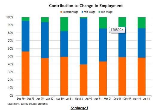
That situation may indeed be something worth worrying about, but if so it is nothing new. The following chart shows the percentages of job gains sorted by low-wage, middle-wage, and high-wage sectors for each of the U.S. expansion periods dating back to 1970:
- more -
http://macroblog.typepad.com/macroblog/2013/08/myth-and-reality-the-low-wage-job-machine.html
In the wake of the July employment report released last week, an interesting graphic appeared in a Wall Street Journal article with the somewhat distressing title "Low Pay Clouds Job Growth." The graphic juxtaposed average wages by sector (as of July 2013) with changes in the numbers of jobs created by sector (from July 2011 through July 2013). I've reproduced that chart below, with a few enhancements:
For the 17 sectors, the red circles represent the five sectors with the lowest average wage as of July. The green circles represent the five sectors with the highest average wages, and the blue circles represent those with average wages between the high and low groups. The size of each of the circles in the chart represents the share of employment in that sector during the July 2011 to July 2013 period.
The clear implication of the article is that things are even worse than you think:
Employers added a seasonally adjusted 162,000 jobs in July, the fewest since March, the Labor Department said Friday, and hiring was also weaker in May and June than initially reported. Moreover, more than half the job gains were in the restaurant and retail sectors, both of which pay well under $20 an hour on average.
That situation may indeed be something worth worrying about, but if so it is nothing new. The following chart shows the percentages of job gains sorted by low-wage, middle-wage, and high-wage sectors for each of the U.S. expansion periods dating back to 1970:
- more -
http://macroblog.typepad.com/macroblog/2013/08/myth-and-reality-the-low-wage-job-machine.html
InfoView thread info, including edit history
TrashPut this thread in your Trash Can (My DU » Trash Can)
BookmarkAdd this thread to your Bookmarks (My DU » Bookmarks)
4 replies, 953 views
ShareGet links to this post and/or share on social media
AlertAlert this post for a rule violation
PowersThere are no powers you can use on this post
EditCannot edit other people's posts
ReplyReply to this post
EditCannot edit other people's posts
Rec (3)
ReplyReply to this post
4 replies
 = new reply since forum marked as read
Highlight:
NoneDon't highlight anything
5 newestHighlight 5 most recent replies
= new reply since forum marked as read
Highlight:
NoneDon't highlight anything
5 newestHighlight 5 most recent replies
= new reply since forum marked as read
Highlight:
NoneDon't highlight anything
5 newestHighlight 5 most recent replies
Myth and Reality: The Low-Wage Job Machine (Original Post)
ProSense
Aug 2013
OP
Bradical79
(4,490 posts)1. Yes, misleading jobs numbers isnt a new thing.
It's just that with each recovery cycle those low wage jobs are worth less and less, making each recovery period less of a real recovery. The lie basically becomes bigger each time due to the constantly increasing wage disparity.
PowerToThePeople
(9,610 posts)2. K&R

hfojvt
(37,573 posts)3. how are things even worse than I think?
I see 750,000 new jobs in the relatively good paying "education and health services" sector. I see over 200,000 new jobs in manufacturing, and I see 450,000 new jobs in the even better paying "professional and technical services" sector.
That looks like 1.2 million relatively good paying job created in the last two years. That is first of all, a positive number and second of all, a fairly substantial part of the total.

ProSense
(116,464 posts)4. That's the WSJ claim, and
the OP piece is attempting to show the trend is not new.