The most Amazing Chart
Last edited Fri Apr 18, 2014, 02:08 AM - Edit history (3)
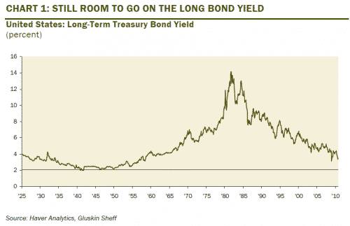
[font color=green]This chart is standard data from the Fed and widely available, but this was the only one going back to the 20s I found that is small enough and that loads. Some pngs don't load in DU links. But googling 10-year treasury chart long-term will confirm the data. Ignore the headline on the graphic--I am not offering an opinion of future bond pricing.
By the way, in the time since the end of this chart the down-trend continued, with treasuries breaking below 2% to the lowest rates ever.[/font color]
What is so amazing is the we expect economic data to be constant zigs and zags, up and down. But looking back, this two massive trends with clear beginnings and ends.
That long uptrend from WWII to the early 1980s is the period when the American middle class came to be. Highest unionization. Large real-dollar wage gains. An immensely productive period featuring steady inflation.
That blow-off spike in the middle (call it 1978-1983) provided the pretext for reversing that long-term trend. It was the 9/11 of finance... the crisis that could be exploited with sweeping ideology-driven changes. Election of Reagan. The Volker recession. Deregulation. The birth of "finance" as dominant industry, etc..
The steady decline period from the Reagan era forward was seen three stock market crashes (depending on definitions), history's two largest asset bubbles, some jobless recoveries, and the biggest economic collapse since the great depression.
But it has been an excellent period for the rich.
 = new reply since forum marked as read
