Welcome to DU!
The truly grassroots left-of-center political community where regular people, not algorithms, drive the discussions and set the standards.
Join the community:
Create a free account
Support DU (and get rid of ads!):
Become a Star Member
Latest Breaking News
General Discussion
The DU Lounge
All Forums
Issue Forums
Culture Forums
Alliance Forums
Region Forums
Support Forums
Help & Search
General Discussion
Related: Editorials & Other Articles, Issue Forums, Alliance Forums, Region ForumsCharts: It's Starting To Look Like The Notorious 1972 Book On The End Of Growth Was Right
Last edited Fri Apr 13, 2012, 06:14 AM - Edit history (1)
http://www.businessinsider.com/charts-the-limits-to-growth-2012-4?nr_email_referer=1&utm_source=Triggermail&utm_medium=email&utm_term=Money%20Game%20Select&utm_campaign=MoneyGame%20Select%202012-04-14CHARTS: It's Starting To Look Like This Notorious Book On The End Of Growth Was Right
Ashley Lutz and Gus Lubin | Apr. 12, 2012, 5:28 PM | 4,769 | 7
On the 40-year anniversary of The Limits Of Growth, Smithsonian magazine finds that this apocalyptic tale of resource depletion may be coming true.
We did some digging on the subject and turned up a report by physicist Graham Turner, who came to the same conclusion in 2008.
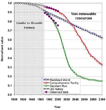
On the following charts, the green line shows the book's baseline scenario, which sees resource depletion leading to a cataclysmic crash in 2030. The red line shows a scenario involving only technological solutions. The blue line shows a scenario involving technological and social solutions. As you can see from the purple line, we are within range of the book's baseline scenario.
MORE (OR LESS AS THE CASE MAY BE) AT LINK[p]
InfoView thread info, including edit history
TrashPut this thread in your Trash Can (My DU » Trash Can)
BookmarkAdd this thread to your Bookmarks (My DU » Bookmarks)
4 replies, 1909 views
ShareGet links to this post and/or share on social media
AlertAlert this post for a rule violation
PowersThere are no powers you can use on this post
EditCannot edit other people's posts
ReplyReply to this post
EditCannot edit other people's posts
Rec (6)
ReplyReply to this post
4 replies
 = new reply since forum marked as read
Highlight:
NoneDon't highlight anything
5 newestHighlight 5 most recent replies
= new reply since forum marked as read
Highlight:
NoneDon't highlight anything
5 newestHighlight 5 most recent replies
= new reply since forum marked as read
Highlight:
NoneDon't highlight anything
5 newestHighlight 5 most recent replies
Charts: It's Starting To Look Like The Notorious 1972 Book On The End Of Growth Was Right (Original Post)
Hissyspit
Apr 2012
OP

geckosfeet
(9,644 posts)1. It looks like there are two sets of observed data -
one overlays the red line and overlays the green line. (Not the Boston T system red and green lines...)
Must be observed data for non-renewables and observed data for the aggregate (red).

bananas
(27,509 posts)3. The red and green lines are for different scenarios (different models)
what the two purple lines indicate isn't clear,
there should only be one purple line.
bananas
(27,509 posts)2. There's two purple lines following different tracks. nt

On the Road
(20,783 posts)4. Actually, the Scenario in That Chart
depends on the trend accelerating beginning the past twenty years and continuing in the next twenty. So far the observed data shows no sign of that.
Nonrenewable resources are by definition declining, and no one knows how fast how fast other materials will be substituted. You can say the jury is still out, but it certainly doesn't confirm the 'standard run' in the chart.