Video & Multimedia
Related: About this forumThe Badass Truth Graph of Republican Politics and COVID
The numbers on this moving graph are the total confirmed normalized* cases per million for each state since June.
A '10,000' means 1% of the state's population has tested positive of COVID since June 1.
June 1 was chosen as it was around that time that countries worldwide that had been sucker-punched months before had the opportunity to apply proven preventative measures.
It also provided an opportunity to contrast the resulting data with states' political affiliations, using the Cook Partisan Voting Index.
The results suggest a strong correlation between a state's political leanings and its ability to employ proven science to slow the spread of COVID.
Sorry this can't be shown here but it's definitely worth the click.
https://dangoodspeed.com/covid/total-cases-since-june
https://flo.uri.sh/visualisation/3835611/embed?auto=1
 = new reply since forum marked as read
Highlight:
NoneDon't highlight anything
5 newestHighlight 5 most recent replies
= new reply since forum marked as read
Highlight:
NoneDon't highlight anything
5 newestHighlight 5 most recent replies
pwb
(11,246 posts)they don't understand that Covid-19 is not an opinion.

ancianita
(35,929 posts)magicguido
(6,315 posts)ancianita
(35,929 posts)Thoughts and prayers indeed.
pandr32
(11,551 posts)Unfortunately, there is going to be a huge financial burden--especially in those red states.
ancianita
(35,929 posts)Last edited Wed Nov 18, 2020, 02:39 PM - Edit history (1)
A relatively new graphic

A relatively old graphic
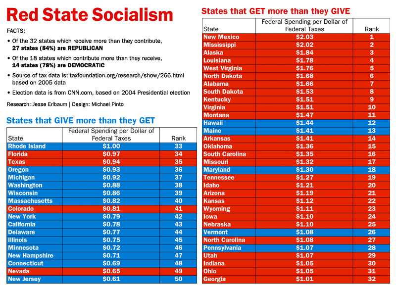
Maybe there will be an update about how some in the tax giver column are now in the tax taker column because of COVID, and vice versa.
Let's say our total tax payout for 2019 was the usual -- about $7.8 TRILLION -- it's not as if we can't afford to help ourselves and postpone the Fed/Treasury debt for a year or two.
The U.S. can really afford what it wants to afford. Austerity Repubs just want to convince us that we don't want to afford other Americans.
pandr32
(11,551 posts)I am bookmarking.

