Photography
Related: About this forumwhich one?
[url=http://www.flickr.com/photos/rdking647/8380452689/][img]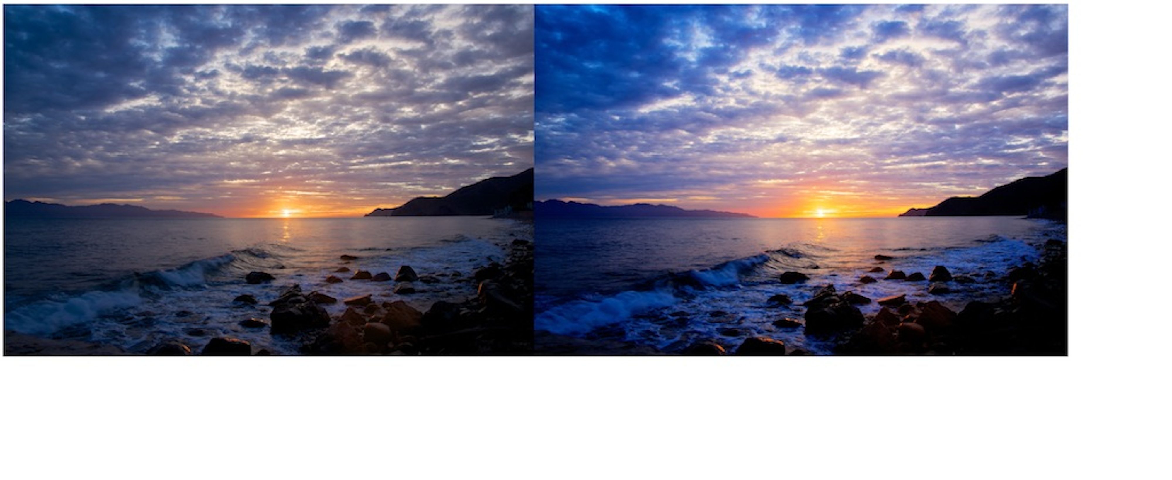 [/img][/url]
[url=http://www.flickr.com/photos/rdking647/8380452689/]Untitled-1[/url] by [url=http://www.flickr.com/people/rdking647/]rdking647[/url], on Flickr
 = new reply since forum marked as read
Highlight:
NoneDon't highlight anything
5 newestHighlight 5 most recent replies
= new reply since forum marked as read
Highlight:
NoneDon't highlight anything
5 newestHighlight 5 most recent replies
liberal N proud
(60,334 posts)It seems brighter.
Speck Tater
(10,618 posts)The right one looks a little "over-cooked" to me. A bit heavy on the HDR or contrast.
Maybe go halfway between the two? 

ManiacJoe
(10,136 posts)But only because it is brighter.
If you just increase the levels/gamma for the one on the left, it looks pretty good without the increased saturation.

JohnnyRingo
(18,623 posts)I feel sorry for my colorblind brother in law, and believe b&w photos are overrated.
I'd go with the one on the right, but had I never seen it, I like the image anyway.

barbtries
(28,787 posts)which one for you?
lovely pictures by the way, making me feel kinda homesick. where is this?
rdking647
(5,113 posts)they are from baja california
barbtries
(28,787 posts)california coast! sniff (i'm from LA)
rdking647
(5,113 posts)sea of cortez by la paz

Stevenmarc
(4,483 posts)But if your editing software has a graduated neutral density filter, increase the exposure to lighten the beach and then apply the filter to darken the sky a bit.

Mira
(22,380 posts)I like the one on the left better. It looks very natural. The one on the right looks manipulated too much.
Either way it is a stunner of a shot.

alfredo
(60,071 posts)
Solly Mack
(90,762 posts)I'm going to have to go with the one on the left.
Looks truer.

2naSalit
(86,507 posts)antiquie
(4,299 posts)I don't know anything about photography, but I know what...

Celebration
(15,812 posts)the blue clouds on the right don't look as natural to me.

Blue_In_AK
(46,436 posts)More natural. I fight those ultra blues here all the time with the snow and all, and I really don't care for them. Just my personal preference.

FreeState
(10,570 posts)the colors and sharpness seem a little more real. The one on the right, while nice, looks like I forgot to take my sunglasses off.
I like both, with the exception of maybe getting some more detail out of the rocks in the bottom right. Excellent job.

klook
(12,153 posts)although I don't want to get PPR'd from this site! 
Actually, upon further gazing, I prefer the one on the left in almost every respect, except that I'd like to see more light / contrast on the beach. Probably hard to do that, though, without messing up the rest of the image.
Beautiful shot!
sir pball
(4,741 posts)The left is too muted, downcast, "natural"...I love saturated, eye-popping (but not clownishly unnatural) colors but the right one is too bluish. IMO it looks like somebody with a marginal knowledge of Photoshop was trying to ape Velvia but failed miserably.
For reference, this is what I think a sunset should look like (Velvia 50, untouched):


SouthernDonkey
(256 posts)I think it's really just a matter of taste or opinion. In my opinion, I like the left one because it is more natural. The colors are lovely on the right but I think it all comes down to what you are trying to accomplish with your photo. Are you trying to depict the beauty as you saw it and it actually was? ...or are you trying to make a velvet Elvis? When I see over the top adjusted photos, I don't think "great photography" I think "photoshop". But thats just me.
I have a "friend" who wanted to "play with" one of my photos in photoshop "for me". He thought he knew what he was doing, and he adjusted this and adjusted that....but all he did was piss me off by messing with my image! I let him know I didn't need his "expertise". In other words...it's your image! You display it as you want the world to see it, and tell the experts to stick it where that sun above is headed. 
I love the photo by the way! Very nice! Especially the one on the left.