Welcome to DU!
The truly grassroots left-of-center political community where regular people, not algorithms, drive the discussions and set the standards.
Join the community:
Create a free account
Support DU (and get rid of ads!):
Become a Star Member
Latest Breaking News
General Discussion
The DU Lounge
All Forums
Issue Forums
Culture Forums
Alliance Forums
Region Forums
Support Forums
Help & Search
Environment & Energy
Related: About this forum2016: Year Of The Black Swan
 ?w=480
This weekend’s new graph of February 2016 temps left a lot of scientists gasping.
Looking for historical “black swan” events of this magnitude, the collapse of the Larsen B Ice shelf in 2002, and 2007’s sudden drop in Arctic sea ice come to mind. We’re watching something very historic unfold, in the midst of a turbulent election year where this could become an issue.
Jeff Masters and Bob Henson at Weather Underground:
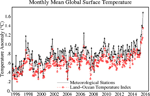
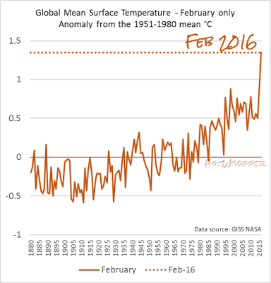
On Saturday, NASA dropped a bombshell of a climate report. February 2016 has soared past all rivals as the warmest seasonally adjusted month in more than a century of global recordkeeping. NASA’s analysis showed that February ran 1.35°C (2.43°F) above the 1951-1980 global average for the month, as can be seen in the list of monthly anomalies going back to 1880. The previous record was set just last month, as January 2016 came in 1.14°C above the 1951-1980 average for the month. In other words, February has dispensed with this one-month-old record by a full 0.21°C (0.38°F)–an extraordinary margin to beat a monthly world temperature record by. Perhaps even more remarkable is that February 2015 crushed the previous February record–set in 1998 during the peak atmospheric influence of the 1997-98 “super” El Niño that’s comparable in strength to the current one–by a massive 0.47°C (0.85°F).
Because there is so much land in the Northern Hemisphere, and since land temperatures rise and fall more sharply with the seasons than ocean temperatures, global readings tend to average about 4°C cooler in January and February than they do in July or August. Thus, February is not atop the pack in terms of absolute warmest global temperature: that record was set in July 2015. The real significance of the February record is in its departure from the seasonal norms that people, plants, animals, and the Earth system are accustomed to dealing with at a given time of year. Drawing from NASA’s graph of long-term temperature trends, if we add 0.2°C as a conservative estimate of the amount of human-produced warming that occurred between the late 1800s and 1951-1980, then the February result winds up at 1.55°C above average. If we use 0.4°C as a higher-end estimate, then February sits at 1.75°C above average.
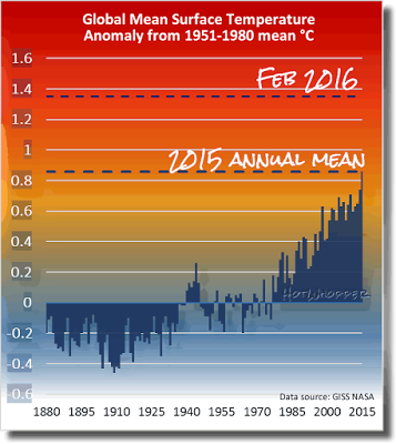
Either way, this result is a true shocker, and yet another reminder of the incessant long-term rise in global temperature resulting from human-produced greenhouse gases. Averaged on a yearly basis, global temperatures are now around 1.0°C beyond where they stood in the late 19th century, when industrialization was ramping up. Michael Mann (Pennsylvania State University) notes that the human-induced warming is even greater if you reach back to the very start of the Industrial Revolution. Making matters worse, even if we could somehow manage to slash emissions enough to stabilize concentrations of carbon dioxide at their current level, we are still committed to at least 0.5°C of additional atmospheric warming as heat stored in the ocean makes its way into the air, as recently emphasized by Jerry Meehl (National Center for Atmospheric Research). In short, we are now hurtling at a frightening pace toward the globally agreed maximum of 2.0°C warming over pre-industrial levels.
 ?w=480
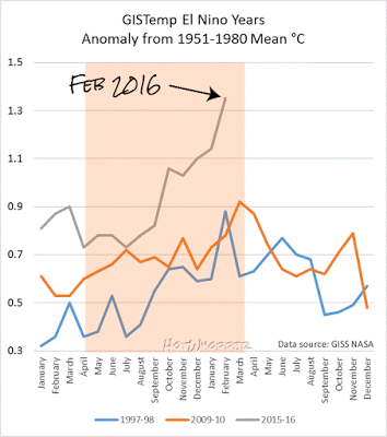
I’ve updated the chart for El Niño years, too. I had to expand the y axis a lot to fit the February data:
 ?w=480
The shaded area is the normal period for an El Niño.
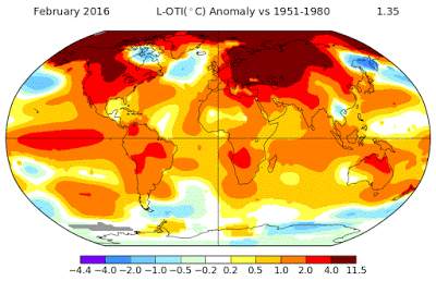
It’s more than El Niño that’s causing the extra heat. Below is a map showing just where it’s getting so hot. It’s the northern hemisphere, including the Arctic, parts of the USA and Canada, and much of northern Europe:
 ?w=480
Look, it’s too soon to post any year to date temperatures, but here’s a chart showing just the months of February:
 ?w=486&h=506
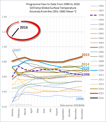
For this year, I’ll have to extend the y axis a whole lot. Here’s a taste. The lines represent the running average. The end point marked 2016 is the average of January and February anomalies this year:
 ?w=498&h=574
EDIT
http://climatecrocks.com/2016/03/14/2016-year-of-the-black-swan/
InfoView thread info, including edit history
TrashPut this thread in your Trash Can (My DU » Trash Can)
BookmarkAdd this thread to your Bookmarks (My DU » Bookmarks)
0 replies, 975 views
ShareGet links to this post and/or share on social media
AlertAlert this post for a rule violation
PowersThere are no powers you can use on this post
EditCannot edit other people's posts
ReplyReply to this post
EditCannot edit other people's posts
Rec (13)
ReplyReply to this post