Democratic Underground Latest Greatest Lobby Journals Search Options Help Login
Google

Progressive Revolution Symbol Design Standards....Thread 2 - ARTISTS!!!

Printer-friendly format Printer-friendly format
Printer-friendly format Email this thread to a friend
Printer-friendly format Bookmark this thread
This topic is archived.
Home » Discuss » Archives » General Discussion (Through 2005) Donate to DU
 
xultar Donating Member (1000+ posts) Send PM | Profile | Ignore Sun Jan-02-05 02:56 PM
Original message
Progressive Revolution Symbol Design Standards....Thread 2 - ARTISTS!!!
It occurred to some and it was brought to my attention that we may have started this process all wrong.
starroute, chaska &, Tinoire have been helping me behind the scenes and nostamj also had the same ideas...we need standards guidelines. It is tough for designers to come up with something without knowing where they should start.

So...

Let's set the foundation with the standards. Things like, should it be an abstract or not? What are the colours of the revolution. What do the colours mean? etc...

starroute came up with some excellent standards to start. Can we get some of your ideas in addition. Great thing about this. No artistic skills needed here.

starroute's standards.
...snip
An abstract sign, not a picture of anything and not a recognizable everyday form like a paper clip.

A design you've never seen before. Something with no prior associations. (Especially not the fleur de lys, which was the symbol of the French monarchy.)

So simple it can be scrawled on a wall or worked into jewelry. Not dependent on the use of color. But also able to be elaborated and decorated.

If possible, something with elements that symbolize solidarity, caring, mutuality, and unity-in-diversity. Probably involving circles more than straight lines.

Actually, what comes to my mind is some of the crop circle designs, which (whatever their real origin) tend to be both extremely powerful and extremely harmonious. ...snip
Printer Friendly | Permalink |  | Top
Taxloss Donating Member (1000+ posts) Send PM | Profile | Ignore Sun Jan-02-05 03:04 PM
Response to Original message
1. Great thoughts, but I disagree with a couple of them.
The symbol - and I identify with the need for such a thing - should look different and new, but its colours should be primarily red, white and blue, and straight lines are fair more effective than circles. The recapturing of RW iconography would be more effective than its abandonment

If you want a direct steal from 1930s German anti-fascist symbols, a stylised white rose would be powerful. I personally feel a dove or olive branch-bearing eagle might be better. Perhaps another animal.
Printer Friendly | Permalink |  | Top
 
BrklynLiberal Donating Member (1000+ posts) Send PM | Profile | Ignore Sun Jan-02-05 03:18 PM
Response to Original message
2. Just a thought to start with....
Edited on Sun Jan-02-05 03:23 PM by BrklynLiberal
The Ancient Asian Peace Symbol:
Said to mean "PEACE: past, present and future"


The color is up for discussion...as is what three objects would be encircled.
Printer Friendly | Permalink |  | Top
 
unpossibles Donating Member (1000+ posts) Send PM | Profile | Ignore Sun Jan-02-05 03:22 PM
Response to Reply #2
3. I like that
Edited on Sun Jan-02-05 03:22 PM by unpossibles
but I think the white rose is brilliant also in making certain parallels. Whant about a white star to make it more our own?
Printer Friendly | Permalink |  | Top
 
alfredo Donating Member (1000+ posts) Send PM | Profile | Ignore Sun Jan-02-05 07:14 PM
Response to Reply #3
18. white rose
on a blue background

Printer Friendly | Permalink |  | Top
 
xultar Donating Member (1000+ posts) Send PM | Profile | Ignore Sun Jan-02-05 04:33 PM
Response to Reply #2
8. I can say I like this one as well. I like the symbolism. Colours and
what is inside the circle matters. We need to hammer those issues out.
Printer Friendly | Permalink |  | Top
 
alfredo Donating Member (1000+ posts) Send PM | Profile | Ignore Sun Jan-02-05 07:24 PM
Response to Reply #2
20. I like that. Two colors, compact, easy to make, and cheap
to reproduce. Most of all, it can be recognized instantly.

the problem is, Pax Cultura is using it.

http://www.13moon.com/banner%20of%20peace.htm

Glad you brought that group to my attention.

The simplicity of design it right on target.
Printer Friendly | Permalink |  | Top
 
eleny Donating Member (1000+ posts) Send PM | Profile | Ignore Sun Jan-02-05 03:36 PM
Response to Original message
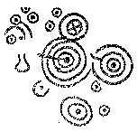
4. Spirals are circular and ancient
Edited on Sun Jan-02-05 03:40 PM by eleny
I didn't read the entire first thread. So, please accept my apologies if this was already suggested and rejected. I chose the spiral since it's an ancient symbol, easy to carve or draw and is circular as you suggested. It's also the basis for fractal geometry which suggests how the universe functions.

Here are a few that I found in a spiral dingbat font I had installed on my drive. It's called xspiralmental.


Edit: Credit to the font creator, Artsy Fartsy. Here is the A/F site http://www.mcaf.com
Printer Friendly | Permalink |  | Top
 
Taxloss Donating Member (1000+ posts) Send PM | Profile | Ignore Sun Jan-02-05 03:43 PM
Response to Reply #4
5. They're beautiful things, but ...
... they lack clarity, and have connotations of "going round in circles".
Printer Friendly | Permalink |  | Top
 
eleny Donating Member (1000+ posts) Send PM | Profile | Ignore Sun Jan-02-05 03:53 PM
Response to Reply #5
6. Going around in circles
Yes, I was wondering about that. But it fit the requested shape. Perhaps a variation would make sense. Just about all the abstracts were used by people in some way. I'm excited abut seeing what develops. I really like the idea of something easy to carve without need for color.
Printer Friendly | Permalink |  | Top
 
xultar Donating Member (1000+ posts) Send PM | Profile | Ignore Sun Jan-02-05 04:32 PM
Response to Reply #4
7. I like spirals but a couple of issues have been brought to light...
Spiral..can represent going down the drain

some people find it difficult to look @ spirals also.
Printer Friendly | Permalink |  | Top
 
xultar Donating Member (1000+ posts) Send PM | Profile | Ignore Sun Jan-02-05 04:35 PM
Response to Original message
9. Ok are you for an abstract symbol or a representative symbol?
Please reply to this post with your take. first words in the subject being Abstract or Non Abstract depending on your preference.
Printer Friendly | Permalink |  | Top
 
Lizzie Borden Donating Member (1000+ posts) Send PM | Profile | Ignore Sun Jan-02-05 04:54 PM
Response to Reply #9
10. Abstract ok.
It's ok as long as people can kinda guess the meaning. I don't want people to react to it by saying "I never would have guessed that." And I'm strongly partial to blue because of the blue states,but red, white and blue is ok.
Printer Friendly | Permalink |  | Top
 
xultar Donating Member (1000+ posts) Send PM | Profile | Ignore Sun Jan-02-05 04:57 PM
Response to Reply #10
11. I was wondering about the blue state thing just this afternoon cuz
it is a MSM thing. But then I realized I'd rather be blue than almost any other colour for this purpose.
Printer Friendly | Permalink |  | Top
 
Debs Donating Member (723 posts) Send PM | Profile | Ignore Sun Jan-02-05 05:15 PM
Response to Reply #11
12. I like
The idea of mixing colors not in a straitedge way, as it has the connotation of inclusion, diversity, and many into one. Also it would not have to be done exactly the same way each time, giving some sense of participation to everyone that scrawled it on a subway wall. I like the circle or some variation of a circle as it symbolizes eternity and universiality. I like the peace sign yet it can be associated with past movements. I think incorporating words is a good idea as it makes direct commitment to ideals, though I see the weaknesses of that also. Mostly I think overall this is an outstanding idea, whatever you come up with
Printer Friendly | Permalink |  | Top
 
Rockerdem Donating Member (706 posts) Send PM | Profile | Ignore Sun Jan-02-05 05:37 PM
Response to Reply #12
15. Circle in rainbow colors would cover a lot of themes
Pretty simple and gets across a lot of strong messages.
Printer Friendly | Permalink |  | Top
 
eleny Donating Member (1000+ posts) Send PM | Profile | Ignore Sun Jan-02-05 05:23 PM
Response to Reply #9
13. Abstract
If you want to be able to carve it easily and not depend on color, that may be the way to go.
Printer Friendly | Permalink |  | Top
 
knight_of_the_star Donating Member (1000+ posts) Send PM | Profile | Ignore Sun Jan-02-05 07:25 PM
Response to Reply #9
21. Representative
That is easier for people to grasp
Printer Friendly | Permalink |  | Top
 
CJCRANE Donating Member (1000+ posts) Send PM | Profile | Ignore Sun Jan-02-05 05:30 PM
Response to Original message
14. One of my designs is...
a Yin-Yang symbol, one half red, the other half blue with two white five pointed stars where the circles go. The name of the design is "UStopia". (I don't have a scan of it handy but should be fairly easy for any amateur graphic designer to recreate).
Printer Friendly | Permalink |  | Top
 
alfredo Donating Member (1000+ posts) Send PM | Profile | Ignore Sun Jan-02-05 06:09 PM
Response to Original message
16. I like the unpossibles idea of a white rose.
Printer Friendly | Permalink |  | Top
 
Taxloss Donating Member (1000+ posts) Send PM | Profile | Ignore Sun Jan-02-05 07:44 PM
Response to Reply #16
22. (Clears throat.) My idea, actually. Check post #1
eom
Printer Friendly | Permalink |  | Top
 
alfredo Donating Member (1000+ posts) Send PM | Profile | Ignore Sun Jan-02-05 10:05 PM
Response to Reply #22
24. Oh... I missed that.
Oh well.
Printer Friendly | Permalink |  | Top
 
CJCRANE Donating Member (1000+ posts) Send PM | Profile | Ignore Sun Jan-02-05 06:21 PM
Response to Original message
17.  The Constitution...
have a little badge/pin that says "We the People.." on it, a similar size to those little Stars and Stripes brooches.
Printer Friendly | Permalink |  | Top
 
knight_of_the_star Donating Member (1000+ posts) Send PM | Profile | Ignore Sun Jan-02-05 07:23 PM
Response to Original message
19. Use a symbol from another movement that worked
Edited on Sun Jan-02-05 07:49 PM by knight_of_the_star
A clenched fist, red encircled by a blue laurel wreath on a white field. Like the Red flag of the Bolshevik revolutionaries, the Red fist represents a willingness to fight for the people and red represents the blood shed by patriots in the past for this country's revolutionary ideals. The Fist symbol was also used by the resistance movement Opnar, who unseated Milosevic through successful grassroots revolution. The Blue laurel wreath is a symbol of both peace and victory, and the combination of colours evokes the flag. This could be used as a flag or you could engrave the fist and laurel onto a pendant or something like that. The overall meaning of the banner is bold action to secure peace and victory with honour and purity. It shows that we are unafraid to act boldly, but we do not desire bloodshed for the sake of bloodshed.

ON EDIT:

A link of what it looks like:

?pfAeJ2BBJPBJxF8m

The wreath has 50 leaves to represent the 50 states
Printer Friendly | Permalink |  | Top
 
starroute Donating Member (1000+ posts) Send PM | Profile | Ignore Sun Jan-02-05 08:08 PM
Response to Original message
23. We don't have to be limited to a single symbol
I feel strongly that we need something so simple and basic that anyone can scrawl it on a wall, something that doesn't depend on color so it can be done in metal or wood or any other medium, something that is universally comprehensible because it isn't dependent on English words.

But some of these other designs are so striking, it makes me want to use all of them. And there's no reason not to -- the 60's had the peace symbol, the manual peace sign ^_^ V , the clenched fist, and so forth.

For an abstract symbol, I've started wondering about the ancient cup-and-ring marks that were carved on megaliths. Not as jittery as a spiral, but with a lot of the same connotations, and it lends itself to variations on a theme.


Printer Friendly | Permalink |  | Top
 
xultar Donating Member (1000+ posts) Send PM | Profile | Ignore Tue Jan-04-05 09:43 AM
Response to Original message
25. Kick! n/t
Printer Friendly | Permalink |  | Top
 
kwyjibo Donating Member (612 posts) Send PM | Profile | Ignore Tue Jan-04-05 10:23 AM
Response to Original message
26. Talk less about the design and more about the meaning
A good designer (I'm sure there are some here) will know what to do as far as design goes. What they need to know is what the design is for. Like working with a client, they need to know everything about the company before they can come up with a logo. This symbol that we're coming up with needs to have a meaning set in stone. The design will be easy once that idea is solid. So maybe there should be another thread about that.
Printer Friendly | Permalink |  | Top
 
DU AdBot (1000+ posts) Click to send private message to this author Click to view 
this author's profile Click to add 
this author to your buddy list Click to add 
this author to your Ignore list Thu Apr 25th 2024, 03:57 PM
Response to Original message
Advertisements [?]
 Top

Home » Discuss » Archives » General Discussion (Through 2005) Donate to DU

Powered by DCForum+ Version 1.1 Copyright 1997-2002 DCScripts.com
Software has been extensively modified by the DU administrators


Important Notices: By participating on this discussion board, visitors agree to abide by the rules outlined on our Rules page. Messages posted on the Democratic Underground Discussion Forums are the opinions of the individuals who post them, and do not necessarily represent the opinions of Democratic Underground, LLC.

Home  |  Discussion Forums  |  Journals |  Store  |  Donate

About DU  |  Contact Us  |  Privacy Policy

Got a message for Democratic Underground? Click here to send us a message.

© 2001 - 2011 Democratic Underground, LLC