ChavezSpeakstheTruth
 (1000+ posts)
Send PM |
Profile |
Ignore
(1000+ posts)
Send PM |
Profile |
Ignore
|
Mon Jan-09-06 05:48 PM
Original message |
| What is your favorite font? |
| Shell Beau
(1000+ posts)
Send PM |
Profile |
Ignore
|
Mon Jan-09-06 05:49 PM
Response to Original message |
| 1. Aerial I guess. At least for normal use. I like |
| Richardo
(1000+ posts)
Send PM |
Profile |
Ignore
|
Mon Jan-09-06 05:49 PM
Response to Original message |
|
Edited on Mon Jan-09-06 05:52 PM by Richardo
I like the way the upper curves in the capital 'P' and 'R' don't quite touch the vertical. :thumbsup:   |
| Rabrrrrrr
(1000+ posts)
Send PM |
Profile |
Ignore
|
Mon Jan-09-06 05:56 PM
Response to Reply #2 |
| 9. Palatino is a beautiful font! |
| CottonBear
(1000+ posts)
Send PM |
Profile |
Ignore
|
Mon Jan-09-06 05:57 PM
Response to Reply #2 |
|
;) I sometimes call it Palamino just for fun! ;)
|
| trof
(1000+ posts)
Send PM |
Profile |
Ignore
|
Mon Jan-09-06 05:50 PM
Response to Original message |
| 3. The Font of All Knowledge. |
|
Edited on Mon Jan-09-06 05:50 PM by trof
that would be me
|
| SiobhanClancy
(1000+ posts)
Send PM |
Profile |
Ignore
|
Mon Jan-09-06 05:50 PM
Response to Original message |
| tigereye
(1000+ posts)
Send PM |
Profile |
Ignore
|
Mon Jan-09-06 05:56 PM
Response to Reply #4 |
|
strangely I've been waiting for someone to ask me this question!
|
| djeseru
(1000+ posts)
Send PM |
Profile |
Ignore
|
Mon Jan-09-06 05:59 PM
Response to Reply #4 |
| 12. Another vote for Papyrus. |
|
There's this gorgeous arabian one that I like as well. I use Times New Roman for my correspondence though.
|
| WritingIsMyReligion
(1000+ posts)
Send PM |
Profile |
Ignore
|
Mon Jan-09-06 06:14 PM
Response to Reply #4 |
| SiobhanClancy
(1000+ posts)
Send PM |
Profile |
Ignore
|
Mon Jan-09-06 06:22 PM
Response to Reply #14 |
| WritingIsMyReligion
(1000+ posts)
Send PM |
Profile |
Ignore
|
Mon Jan-09-06 06:53 PM
Response to Reply #16 |
|
:hi::hi:
I love your screen name! Siobhan is, like, the best name EVAH. :D :P :D
|
| hippywife
(1000+ posts)
Send PM |
Profile |
Ignore
|
Mon Jan-09-06 09:00 PM
Response to Reply #4 |
| 33. Add another for papyrus! n/t |
| William Bloode
(1000+ posts)
Send PM |
Profile |
Ignore
|
Mon Jan-09-06 09:15 PM
Response to Reply #4 |
|
Edited on Mon Jan-09-06 09:17 PM by William Bloode
I prefer papyrus as well. It just looks vey elegent to me.
|
| Book Lover
(1000+ posts)
Send PM |
Profile |
Ignore
|
Mon Jan-09-06 05:53 PM
Response to Original message |
| 5. Can't go wrong with Caslon! |
|
But I'm talking about the hot metal Caslon I'm looking at right now. I have no idea what foundry it's from - maybe M&H?
|
| TreasonousBastard
(1000+ posts)
Send PM |
Profile |
Ignore
|
Tue Jan-10-06 01:04 PM
Response to Reply #5 |
| 43. I agree with Caslon... |
|
and I have a Casque open face (which is really Caslon stolen by someone-- or vice-versa) that is one of my favorite faces for headings.
I have a dozen or so fonts that I regularly use out of thr hundreds I have, and the biggest problem I see with fonts is when they get in the way of the text. I usually end up using Arial or a simpler serif font just so it doesn't get noticed when someone is reading the text.
Some of the most interesting serif fonts I have just seem to be a bit too much for blocks of text.
|
| ghostsofgiants
(1000+ posts)
Send PM |
Profile |
Ignore
|
Mon Jan-09-06 05:53 PM
Response to Original message |
| Omphaloskepsis
(1000+ posts)
Send PM |
Profile |
Ignore
|
Mon Jan-09-06 05:55 PM
Response to Original message |
| WritingIsMyReligion
(1000+ posts)
Send PM |
Profile |
Ignore
|
Mon Jan-09-06 06:14 PM
Response to Reply #7 |
| 15. I really like Skia, as well, on Macs. |
| Dukkha
(1000+ posts)
Send PM |
Profile |
Ignore
|
Mon Jan-09-06 06:53 PM
Response to Reply #7 |
| 23. I used that on my last album cover |
| Jamastiene
(1000+ posts)
Send PM |
Profile |
Ignore
|
Mon Jan-09-06 05:56 PM
Response to Original message |
|
It's so old punk. I love it.
|
| Hong Kong Cavalier
(1000+ posts)
Send PM |
Profile |
Ignore
|
Mon Jan-09-06 06:04 PM
Response to Original message |
|
Very simple sans-serif font...  |
| ChavezSpeakstheTruth
(1000+ posts)
Send PM |
Profile |
Ignore
|
Mon Jan-09-06 06:24 PM
Response to Reply #13 |
| Hong Kong Cavalier
(1000+ posts)
Send PM |
Profile |
Ignore
|
Tue Jan-10-06 12:27 PM
Response to Reply #17 |
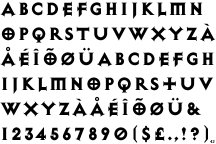
| 42. My favorite serif font, however, is Lilith Heavy |
|
 There's something just neat about this font... |
| asthmaticeog
(1000+ posts)
Send PM |
Profile |
Ignore
|
Mon Jan-09-06 06:28 PM
Response to Original message |
| 18. Sand, Impact and Comic Sans. |
|
Couldn't get SHIT done without those three.
|
| Blue-Jay
(1000+ posts)
Send PM |
Profile |
Ignore
|
Mon Jan-09-06 08:06 PM
Response to Reply #18 |
|
Even the name of that font is impressive! Add it to a nice bright red color, and you're suddenly an unstoppable motherfucker.
|
| redqueen
(1000+ posts)
Send PM |
Profile |
Ignore
|
Mon Jan-09-06 06:29 PM
Response to Original message |
| Mutley
(1000+ posts)
Send PM |
Profile |
Ignore
|
Mon Jan-09-06 08:05 PM
Response to Reply #19 |
| XNASA
(1000+ posts)
Send PM |
Profile |
Ignore
|
Tue Jan-10-06 01:12 PM
Response to Reply #19 |
| 45. I'll third Comic Sans. |
|
I try to use it for all work related stuff if I can.
|
| Elidor
(1000+ posts)
Send PM |
Profile |
Ignore
|
Mon Jan-09-06 06:37 PM
Response to Original message |
|
With a full set of discretionary ligatures. Named for one of the pioneers of typsetting, Nicolas Jenson, who created one of the great faces of all time in the 1470's in Italy, on which this type is based. Baskerville is another favorite. Caslon is also quite tasty. And I have to force myself not to overuse Celestia Antiqua.
|
| pinniped
(1000+ posts)
Send PM |
Profile |
Ignore
|
Mon Jan-09-06 06:46 PM
Response to Original message |
|
Edited on Mon Jan-09-06 06:49 PM by pinniped
 Wow, I just checked out this papyrus font and it does look cool. |
| Dukkha
(1000+ posts)
Send PM |
Profile |
Ignore
|
Mon Jan-09-06 06:52 PM
Response to Original message |
| GirlinContempt
(1000+ posts)
Send PM |
Profile |
Ignore
|
Mon Jan-09-06 08:04 PM
Response to Original message |
| clbuck
(699 posts)
Send PM |
Profile |
Ignore
|
Mon Jan-09-06 08:04 PM
Response to Original message |
|
The Apple Computer corporate font used on the ubiquitous iPod ads.  |
| evlbstrd
(1000+ posts)
Send PM |
Profile |
Ignore
|
Mon Jan-09-06 08:06 PM
Response to Original message |
| 29. Ya see, that's the problem. |
|
There is no favorite font. There is the appropriate typeface for the project.
|
| Book Lover
(1000+ posts)
Send PM |
Profile |
Ignore
|
Mon Jan-09-06 08:10 PM
Response to Reply #29 |
| 31. But have you no personal preferences? |
|
I am a project manager - I also know about subsuming what one likes for what is market-appropriate or project-correct. But what about when you do your own stuff for fun? :-)
|
| evlbstrd
(1000+ posts)
Send PM |
Profile |
Ignore
|
Mon Jan-09-06 08:16 PM
Response to Reply #31 |
| 32. It depends on what I'm doing. |
|
I like Adobe Caslon for printed personal correspondence. But I'll try other classic faces. Cartoony, script or gimmicky types don't cut it for me for anything at all.
|
| ChavezSpeakstheTruth
(1000+ posts)
Send PM |
Profile |
Ignore
|
Mon Jan-09-06 09:04 PM
Response to Reply #29 |
| 34. No - you can have one you have a favorite |
| evlbstrd
(1000+ posts)
Send PM |
Profile |
Ignore
|
Mon Jan-09-06 09:50 PM
Response to Reply #34 |
| 37. I may be into a weird territory here. |
|
I was designing with and setting type when the "DTP revolution" happened, and we were suddenly reduced to the thirteen families available to us on the LaserWriter. I don't care if I never see Palatino or Zaph Chancery again.
We're finally getting good typography again with Open Type format faces.
I just can't choose one favorite. Pointing out beautiful designs is another question.
|
| Left Is Write
(1000+ posts)
Send PM |
Profile |
Ignore
|
Mon Jan-09-06 08:09 PM
Response to Original message |
|
I pretty much stick to Times New Roman, Bookman Old Style, Courier, and Georgia.
|
| ChoralScholar
(1000+ posts)
Send PM |
Profile |
Ignore
|
Mon Jan-09-06 09:36 PM
Response to Original message |
| Redstone
(1000+ posts)
Send PM |
Profile |
Ignore
|
Mon Jan-09-06 09:59 PM
Response to Original message |
| 38. For what? Book text? Ornamental heads? Commercial print ads? |
|
Different ones work for different applications.
Rather, ask what typefaces (I'm old, and insist on calling them by the proper name of typefaces, rather than fonts) I despise.
There are three: Lithos, Helvetica, and dammit, that other Swiss font that I despise with the very thin strokes, I can't believe I forgot the name but I'm not going to turn on the other computer so I can look it up. But I despise it as much as I do the other two, and EVERY Swiss, German, and Austrian company still usese it in EVERY one of their print ads.
Just like every American company with zero imagination and an in-house "designer" uses Helvetica, and lots of it. And all the text is always centered.
By the way, that's a GUARANTEED way to spot a print ad (or a web page) that's been "designed" by an amateur: Center-aligned text. think about that as you cruise around the web over the next few days, and tell me it isn't true.
Redstone
|
| October
(1000+ posts)
Send PM |
Profile |
Ignore
|
Mon Jan-09-06 10:04 PM
Response to Original message |
| 39. Garmond in italics is nice, and Harrington is sweet |
|
I don't know how to display them, though.
|
| Sugar Smack
(1000+ posts)
Send PM |
Profile |
Ignore
|
Mon Jan-09-06 10:09 PM
Response to Original message |
| 40. I think "JUICE ITC" but that's because it's so comforting. |
|
Or maybe Cute. I also like Californian FB, Gautami and Hattenschweiller.
|
| politicat
(1000+ posts)
Send PM |
Profile |
Ignore
|
Mon Jan-09-06 11:03 PM
Response to Original message |
| 41. Humanist or Herculanum |
|
The former for most writing, the latter for anything I want pretty.
|
| DS1
(1000+ posts)
Send PM |
Profile |
Ignore
|
Tue Jan-10-06 01:05 PM
Response to Original message |
| AngryAmish
(1000+ posts)
Send PM |
Profile |
Ignore
|
Tue Jan-10-06 01:12 PM
Response to Original message |
| Heidi
(1000+ posts)
Send PM |
Profile |
Ignore
|
Tue Jan-10-06 01:14 PM
Response to Original message |
| Commie Pinko Dirtbag
(1000+ posts)
Send PM |
Profile |
Ignore
|
Tue Jan-10-06 01:40 PM
Response to Original message |
|
If you can read this, you haven't it installed. But I guess it's quite standard now. It can even be installed under Linux -- I got it from http://corefonts.sourceforge.net .
|
| ChavezSpeakstheTruth
(1000+ posts)
Send PM |
Profile |
Ignore
|
Tue Jan-10-06 03:24 PM
Response to Reply #48 |
| Commie Pinko Dirtbag
(1000+ posts)
Send PM |
Profile |
Ignore
|
Tue Jan-10-06 03:32 PM
Response to Reply #49 |
| 50. That one is not freely available for other OSs |
|
Can't legally install it on Linux unless I have a Windows license (i.e. dual-boot machine).
|
DU
AdBot (1000+ posts)     |
Fri Apr 26th 2024, 01:17 PM
Response to Original message |