Figure 8 is a little calculation I made, trying to figure out the cost of capacity on more of a comparable basis, adjusting for utilization.
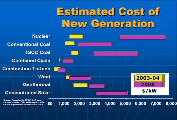
In Figure 8, the nominal costs per 1,000 watts of capacity are my estimates regarding what the FERC amounts shown in Figure 7 are, underlying the graph amounts. The percentage of capacity is the average of the last four years of the actual percentage of summer capacity, from Figure 5 or 6. The adjusted cost of comparable capacity shown in the last two columns is simply the nominal capacity divided by the utilization.
One can argue whether these numbers are comparable, even after adjustment. For one thing, there are differences in the quality of electricity produced--whether it is available on demand, or not. There are also differences in how many years plants can be expected to operate, operating costs, and the cost of fuel.
On this basis, wind comes out comparable in cost to nuclear, but without the cost of nuclear fuel. Coal and natural gas seem to be quite a bit cheaper (neglecting the considerable cost of fuel). Geothermal seems to be especially cost effective when one considers the lack of fuel costs.
I have added a line for Solar PV, based on the indications of this study from Berkeley regarding the installed cost of solar PV. The numbers are so high that one wonders whether something is wrong with the calculation.
http://www.theoildrum.com/node/6935"Figure 8"

"Figure 7"