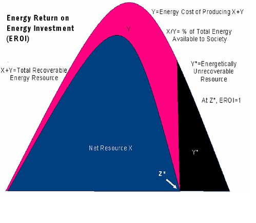
(If the site disallows linking binaries and the picture is "broken", paste "http:/ /www.theoil drum.com/uploads/1 2/plateau_may06.p ng" into your browser --
without the spaces, which I put in to fool the linker -- to see it.
(No restrictive linking warnings were found, and most of The Oil Drum's material is CC-SA.))
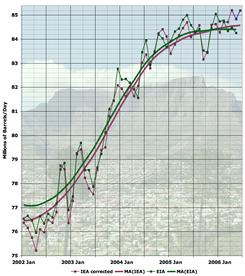
Notice that it indicates that we're at Peak Oil
now, at least as far as the EIA and IEA are concerned, and they account for nearly
all the oil produced today. If the Peak Oil phenomenon is going to result in a roughly symmetrical curve, as
R. C. Duncan thinks it will, we'll be
measurably on the downslope by 2010.
My criticisms of this graph is that the left side of the graph is artificially "flat" and that the flatness is an artifact of both a) a period of flat growth and b) the mathematical errors of the beginning of the moving average curve calculation. Note, too, that the graph isn't zero-based, but runs from 75.0 to 85.4 million barrels of oil per day. Finally, in the Duncan article linked at dieoff.org, the peak of which he writes is the world per-capita energy consumption, a different, and even more pessimistic, statistic.
The oil production drop-off rate is likely to average about 5% per year after the first couple of years, or a halving of supply each 14 years, according to the
Rule of 72. And keep in mind, world population is still growing, with a doubling time of about 40 years. If this chart accurately shows Peak Oil, without a major program to bring non-petroleum-based energy online, we'll be measurably headed back into the "Olduvai Gorge" shortly after the next presidential election.
--p!