
As you can see, the states have been stretched and squashed, some of them substantially, to give them the appropriate sizes, though it's done in such a way as to preserve the general appearance of the map, so far as that's possible. On this map there is now clearly more blue than red.
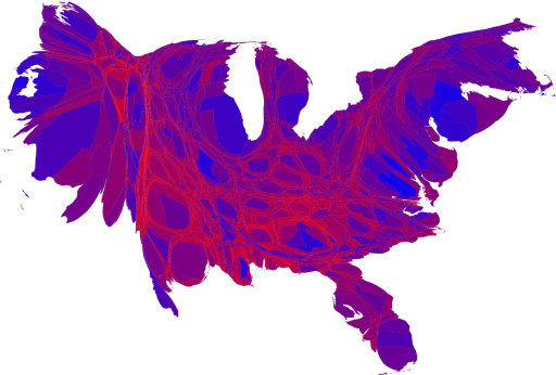
As this map makes clear, large portions of the country are quite evenly divided, appearing in various shades of purple, although a number of strongly Democratic (blue) areas are visible too, mostly in the larger cities. There are also some strongly Republican areas, but most of them have relatively small populations and hence appear quite small on this map.
more maps at:
http://www-personal.umich.edu/~mejn/election/2008/