PretzelWarrior
 (1000+ posts)
Send PM |
Profile |
Ignore
(1000+ posts)
Send PM |
Profile |
Ignore
|
Thu Nov-06-08 03:52 PM
Original message |
| What was THE BEST election map for you in 2004? any 2008 updates? |
|
I'd love to see a completely WHITE background map with the state outlined in the color it was regarding electoral votes and then the red dots/blue dots for each county won by either Obama or McCain. THen the dot should expand to wider and wider circle based on population in that county.
ANyone? ANyone?
screw that "land mass" type of map. I don't care if Wyoming won and looks HUGE. It has less people than many cities--let along tiny states like Massachusettes, Rhode Island, and Delaware.
|
| Essene
(1000+ posts)
Send PM |
Profile |
Ignore
|
Thu Nov-06-08 03:53 PM
Response to Original message |
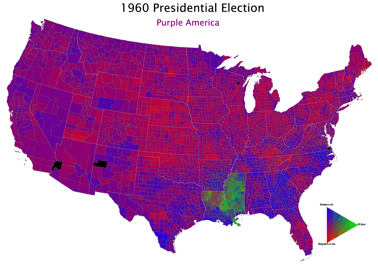
| 1. 1960-2004 multiyear map |
| PretzelWarrior
(1000+ posts)
Send PM |
Profile |
Ignore
|
Thu Nov-06-08 03:55 PM
Response to Reply #1 |
| 2. wow. gotta admit that is a great one |
| PretzelWarrior
(1000+ posts)
Send PM |
Profile |
Ignore
|
Thu Nov-06-08 03:57 PM
Response to Original message |
| 3. addition to my thoughts. the COLOR of the dot or circle should be |
|
shaded to a degree of blue or red based on <5% difference in county, 6%-20% diff, <20% or some other method.
|
| PretzelWarrior
(1000+ posts)
Send PM |
Profile |
Ignore
|
Thu Nov-06-08 04:04 PM
Response to Original message |
|
Edited on Thu Nov-06-08 04:05 PM by PretzelWarrior
http://www-personal.umich.edu/~mejn/election/2008/the link above also shows other ways of weighting for population size, etc. 
|
| PretzelWarrior
(1000+ posts)
Send PM |
Profile |
Ignore
|
Thu Nov-06-08 04:29 PM
Response to Reply #4 |
| 5. here's another one reflecting population in Washington Post |
DU
AdBot (1000+ posts)     |
Tue Apr 23rd 2024, 11:03 AM
Response to Original message |