Democratic Underground Latest Greatest Lobby Journals Search Options Help Login
Google

"Purple America": Maps & Analysis 1960-2008 (nerdgasms)

Printer-friendly format Printer-friendly format
Printer-friendly format Email this thread to a friend
Printer-friendly format Bookmark this thread
This topic is archived.
Home » Discuss » Archives » General Discussion: Presidential (Through Nov 2009) Donate to DU
 
Essene Donating Member (1000+ posts) Send PM | Profile | Ignore Thu Nov-06-08 07:41 PM
Original message
"Purple America": Maps & Analysis 1960-2008 (nerdgasms)
Edited on Thu Nov-06-08 07:44 PM by Essene
My fellow Americans, let's look at the growing purple America. See my comments & questions below.

1960-2004 animated gif


2004 alone


2008 Purple breakdown, Shift-to-Blue and "bubble" proportions


my comments & questions


First of all, I was very confused when I saw the 2008 "purple" map because it looked identical to the 2004 map until I did much closer study. For the most part, the change was one of intensity. What I think this means is that we need to understand this huge win as a mood swing (especially among independents), and less as some dramatic shift in the country's partisan make-up.

I think it's potentially moving in that direction, but let's look at this shift as well.

While a 7% lead at 53-54% is very significant, the population didn't seem to change much. It just leaned away from Red. Few areas really had more than a 20% shift from 2004. Let's focus on the population points themselves.


To mitigate the risk of sounding negative and Concerned (TM), let me add a fun observation. John Mccain received less votes than Kerry did in 2004. While Obama carried less states than Bush did, he also brought in more EVs and several million more votes. As a proportion, it's Obama's 53% to Bush's 50.7% which means Obama won a larger chunk than we've seen a President win since 1996.

However, I have questions.

  • We've seen 2 back-to-back mega-gains for Dems in Congress. Can we really expect another in 2010? Is there room for more areas to shift purple-blue or are we "stuck" in the current demographic breakdowns and going to just see shifts in intensity?

  • What would it take for more areas to swing purple-blue?

  • What is driving the intensity of the red bubbles? The "culture wars" pro-USA identity? Fear? A sense of "war" patriotism?

  • Is there any correlation to military bases?

  • How easily can the mood swing back to the 2004 intensity and leanings?


  • Printer Friendly | Permalink |  | Top
    Essene Donating Member (1000+ posts) Send PM | Profile | Ignore Thu Nov-06-08 07:57 PM
    Response to Original message
    1. Correlation to military bases?
    Edited on Thu Nov-06-08 07:58 PM by Essene
    (large pdf file with military bases on a map)
    http://www.globalsecurity.org/military/facility/images/bases.pdf

    Has anybody researched this stuff?

    At first glance, there appears to be a very disturbing correlation between large chunks of military bases and those red bubbles. I'd love to see figures in terms of total Federal $$$ poured into these different bases as well as total enlisted/family populations with them.

    I can't say I am surprised but seeing the maps laid out next to each other is a little unsettling.

    Printer Friendly | Permalink |  | Top
     
    Leopolds Ghost Donating Member (1000+ posts) Send PM | Profile | Ignore Fri Nov-07-08 09:05 AM
    Response to Original message
    2. 2 questions -- where is the original Times article with maps everyone is talking about?
    And secondly, is there any place to get the maps where they don't flash from one to the other?

    That is very useful for the population bubble gif but not for the others.
    Printer Friendly | Permalink |  | Top
     
    Essene Donating Member (1000+ posts) Send PM | Profile | Ignore Fri Nov-07-08 09:41 AM
    Response to Reply #2
    3. Here ya go - LOTS of maps
    Edited on Fri Nov-07-08 09:55 AM by Essene
    I also did an overlap of military bases against this, but until i get data on the POPULATION of those bases i think it's useless.

    Here is the NY Times data http://elections.nytimes.com/2008/results/president/map.html

    Here is Robert Vanderbei's data http://www.princeton.edu/~rvdb/JAVA/election2008/


    2008 purple america


    1984-2004 purple america


    2008 vs 2004 shift


    2008 vs 1992 shift


    2008 bubbles


    Circle sizes proportion to lead in county


    2004 bubbles


    Circle sizes proportion to lead in county


    1992 bubbles


    Circle sizes proportion to lead in county


    And some relevant http://pewresearch.org/pubs/773/fewer-voters-identify-as-republicans">Pew data (march 2008)


    Printer Friendly | Permalink |  | Top
     
    foo_bar Donating Member (1000+ posts) Send PM | Profile | Ignore Fri Nov-07-08 09:50 AM
    Response to Reply #3
    4. can you compare (what was) the third graph to (GIS) altitude data?
    Edited on Fri Nov-07-08 09:51 AM by foo_bar
    "2008 vs 2004 shift" looks like a relief map, most of the red-shifting areas are in the Ozarks, Appalachians, Alleghenies, a blotch on the Rockies, and the Alaska mountains, locations where oxygen is scarce.
    Printer Friendly | Permalink |  | Top
     
    Essene Donating Member (1000+ posts) Send PM | Profile | Ignore Fri Nov-07-08 10:03 AM
    Response to Reply #4
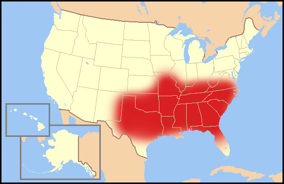
    5. Appalachia, Bible Belt, Baptists, Pentecostals and Poverty
    Edited on Fri Nov-07-08 10:06 AM by Essene
    Obviously population centers are represented in a lot of the patterns. I think there are several dynamics, and i think it's important to understand what that map really IS. It's simply indicating which zones shifted 1-20% in one direction or the other since 2004. If you look at the 2008 vs 1992, you can see a different picture.

    I think it's safe to say there is an "Appalachian" factor in many of those counties that hardened even father to the red.


    Compare with poverty rates (2000)


    I also think it's important to notice this ties into the Bible Belt more than anything else.

    More specifically, let's look at Baptists & Pentecostals


    Printer Friendly | Permalink |  | Top
     
    foo_bar Donating Member (1000+ posts) Send PM | Profile | Ignore Fri Nov-07-08 10:21 AM
    Response to Reply #5
    6. you're probably right
    Edited on Fri Nov-07-08 10:23 AM by foo_bar
    although the Baptist region would indicate VA/NC at least (were they not counterbalanced by opposing social/population forces), and even SC looks net blue everywhere (along with MS but some of that might be post-Katrina diaspora), but OK/AR/TN are pure red shift so I have to wonder what combination of factors moved them towards the red but not (most of) Alabama or the Carolinas (whereas Clinton '96 went red vs. 92 in (most of) the strip from VA to GA to MS, IIRC).
    Printer Friendly | Permalink |  | Top
     
    Essene Donating Member (1000+ posts) Send PM | Profile | Ignore Fri Nov-07-08 10:33 AM
    Response to Reply #6
    7. We'd also need to look at the congressional districts and recent job losses
    Edited on Fri Nov-07-08 10:34 AM by Essene
    I think there are a lot of factors, none of which are 100% correlated to the shifts.

    I bet those biggest shifts to blue/red were also battleground districts and perhaps also had massive job losses in the last few years. I'm just speculating. But those big jumps to the red in 2008 are weird, and i can easily imagine those being hot spots where a lot of very nasty anti-Obama ads ran or something equivalent for local/state elections.

    People staying republican is one thing, but them becoming MORE republican this year is really hard to fathom.

    It's obviously going to also imply some of the most racist and fearful communities in america.
    Printer Friendly | Permalink |  | Top
     
    Essene Donating Member (1000+ posts) Send PM | Profile | Ignore Fri Nov-07-08 12:01 PM
    Response to Reply #7
    11. Map of contested House seats
    Edited on Fri Nov-07-08 12:02 PM by Essene
    You can see here how a lot of the strange "farther red" areas may have been due to heavily media saturated congressional races. In fact, many of these hottest red areas in the bible belt overlap with incumbent democrats in the House.


    Printer Friendly | Permalink |  | Top
     
    supernova Donating Member (1000+ posts) Send PM | Profile | Ignore Fri Nov-07-08 10:47 AM
    Response to Reply #6
    8. NC religiosity
    Actually, NC as a whole does not have Baptist/Pentacostal Fever.

    Oh, we have them for sure, it's just that they don't influence our regional character to the extent they wish.

    NC was settled by Quakers, Presbyterians, Moravians (a pacifist group from the Czech regions).

    None of these groups is the hell fire and brimstone crowd.

    Today that means that most people don't go to church to hear a lecture about whom to vote for. And churches absolutely don't try to influence political matters as a church. Not the way say, the Mormon Church largely financed Prop 8 in Calif.


    Printer Friendly | Permalink |  | Top
     
    grantcart Donating Member (1000+ posts) Send PM | Profile | Ignore Fri Nov-07-08 10:50 AM
    Response to Reply #3
    9. these maps show it but weight it by population
    Printer Friendly | Permalink |  | Top
     
    Essene Donating Member (1000+ posts) Send PM | Profile | Ignore Fri Nov-07-08 05:39 PM
    Response to Reply #9
    12. The analysis he's done with those is very biased
    I had been using his maps when i realized he changed the shading and skewed the 2009 physically... making it look less blue.

    I had tried to add the 2008 map to his 1960-2004 animated gif when i realized it just wouldnt fit, and i couldnt just rotate the image or adjust the hue to fix it.

    And when i look at his analysis on the population weighted maps, he says "this map makes clear, large portions of the country are quite evenly divided" which is not really what i see in looking at what he presents. Quite the opposite, the population map shows that the vast majority is blue/purple with only some slivers or true red.

    Printer Friendly | Permalink |  | Top
     
    Essene Donating Member (1000+ posts) Send PM | Profile | Ignore Fri Nov-07-08 10:56 AM
    Response to Original message
    10. household income and campaign spending maps
    Printer Friendly | Permalink |  | Top
     
    Duppers Donating Member (1000+ posts) Send PM | Profile | Ignore Mon Nov-10-08 12:43 AM
    Response to Original message
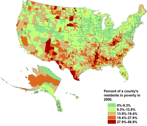
    13. Great maps! Here's another one based on poverty.....
    Edited on Mon Nov-10-08 12:47 AM by Duppers
    I just came across some maps posted on a blog and did a search here before posting my find.


    See any patterns? It appears that, for the most part, the areas that voted for Obama
    are also the areas that have the lowest poverty rates and the smallest gap between rich and poor. And conversely, the areas that went for McCain tend to have more poverty and show a greater disparity between rich and poor.

    All of which seems to indicate that the places suffering the most during this economic crisis are the ones that continue to vote for the party whose economic policies favor well-heeled, corporate interests - and that the areas that are not quite so bad off are going for the party that historically has been on the side of the poor and the working class, and that has promised to do more directly for working people in this election.

    Go figure.

    ....Annie says: If you overlay an education map with the rates of high school graduations and the numbers who pursue and graduate from post secondary school educations, you will get a fairly close correlation with the poverty and income inequality maps.

    The worse off people are in the areas of meeting basic needs _ adequate and consistent/reliable nutrition, clean water, safe and comfortable shelter, safe and reliable transportation, competent schools and education, the more likely it is that people will not have developed even basic competencies in critical thinking, using evidence in order to make decisions and being able to have and to make choices which are based on long term goals.

    http://www.theseminal.com/2008/11/09/fun-with-maps-electoral-poverty/


    Edited to shrink my map.

    Thank you for your post and all the maps, Essene. I'm bookmarking this thread.


    Printer Friendly | Permalink |  | Top
     
    Posteritatis Donating Member (1000+ posts) Send PM | Profile | Ignore Mon Nov-10-08 01:41 AM
    Response to Original message
    14. What's up with Louisiana and Mississippi in '60 and '64? (nt)
    Printer Friendly | Permalink |  | Top
     
    Odin2005 Donating Member (1000+ posts) Send PM | Profile | Ignore Mon Nov-10-08 01:46 AM
    Response to Original message
    15. Interesting that while the coastal South is going blue the interior South...
    ...is becoming more red.
    Printer Friendly | Permalink |  | Top
     
    DU AdBot (1000+ posts) Click to send private message to this author Click to view 
this author's profile Click to add 
this author to your buddy list Click to add 
this author to your Ignore list Thu Apr 25th 2024, 04:21 PM
    Response to Original message
    Advertisements [?]
     Top

    Home » Discuss » Archives » General Discussion: Presidential (Through Nov 2009) Donate to DU

    Powered by DCForum+ Version 1.1 Copyright 1997-2002 DCScripts.com
    Software has been extensively modified by the DU administrators


    Important Notices: By participating on this discussion board, visitors agree to abide by the rules outlined on our Rules page. Messages posted on the Democratic Underground Discussion Forums are the opinions of the individuals who post them, and do not necessarily represent the opinions of Democratic Underground, LLC.

    Home  |  Discussion Forums  |  Journals |  Store  |  Donate

    About DU  |  Contact Us  |  Privacy Policy

    Got a message for Democratic Underground? Click here to send us a message.

    © 2001 - 2011 Democratic Underground, LLC