Democratic Underground Latest Greatest Lobby Journals Search Options Help Login
Google

Fire up your Photo Editor......it’s pic challenge time

Printer-friendly format Printer-friendly format
Printer-friendly format Email this thread to a friend
Printer-friendly format Bookmark this thread
This topic is archived.
Home » Discuss » DU Groups » Arts & Entertainment » Photography Group Donate to DU
 
F.Gordon Donating Member (1000+ posts) Send PM | Profile | Ignore Sat Oct-07-06 12:07 AM
Original message
Fire up your Photo Editor......it’s pic challenge time
I miss alfredo’s challenges so I thought I’d throw one out there. The pic was made as “neutral” as possible in RAW. This is what it looks like.


It has a whole bunch of “problems” and “challenges”. You can download a 4 meg JPEG version to work with by going to this link and clicking on ‘O’riginal, or by copying the above link and changing the “M” to “O” in the file name.

http://www.forumphotogroup.com/gallery/643162/4/100541722/Medium

If you decide to accept this mission this thread will self-destruct in 5, 4, 3.… and it’d be nice if you include what you did so others can maybe learn a thing or three. I’m still working on my version and will post it eventually.

Need to get the challenge smugalug galleries updated and the photo links thing going. Any help with links would be greatly appreciated.
:hi:

Printer Friendly | Permalink |  | Top
regnaD kciN Donating Member (1000+ posts) Send PM | Profile | Ignore Sat Oct-07-06 05:18 AM
Response to Original message
1. Here's mine...


Procedure

1) Open with Photoshop.

2) Run NoiseNinja (it really didn't need it, but I do that to every image I process).

3) Using Photoshop's Shadows/Highlights adjustment, bring up the shadows by Amount 50, Tonal Width 19, Radius 89.

4) Convert to LAB Color.

5) Apply Curves. Bring in the endpoints of the A and B curves by about two gridlines at each end to intensify the colors. In Lightness, steepen the curve through the lower half to bring out the highlights on the bushes at the lower left and the reddish part of the shadowed cliff, making the left side of the image a bit less of a dark hole worthy of Calcutta.

6) Since I want to bring out the yellow foliage of the tree in the center distance, duplicate the image onto another layer. Reapply Curves to that new layer, this time skewing the B curve to make the leaves more yellow and the Lightness curve to make it brighter. Of course, the whole image now looks weird -- over-bright and tinted yellow -- but ignore that for the moment.

7) Attach a Layer Mask to the new layer and fill it with black (Layer/Layer Mask/Hide All). The image returns to normal. Take a small, soft brush (I used a radius of 35) and select white as the foreground color. Click on the mask in the Layers window, then enlarge the image and "paint" in white over the tree's foliage (and nothing else). Painting that with white will cause that section of the new layer to appear over the previous layer, so that only the tree will look brighter and have greater yellow saturation.

8) Flatten the image and resize it as desired (I used 800 pixels wide).

9) Run TLR's Output Sharpening script (a great free add-on) with Web/Multimedia and 800 pixels wide as the settings.

10) Convert the image from LAB to sRGB, flattening the image during conversion.

11) Save using Photoshop's Save for Web... command, choosing JPEG at high quality.

I hope this can be of use. If this had been my image, I might have considered using the clone brush to take out the transmitter antenna on the hill behind the yellow tree, but I thought that might be a bit much to do to someone else's image without determining whether they wanted it changed.

Printer Friendly | Permalink |  | Top
 
alfredo Donating Member (1000+ posts) Send PM | Profile | Ignore Sat Oct-07-06 11:55 PM
Response to Reply #1
14. Here's mine


made a duplicate, then monochromed the original

I then I copied and pasted the color duplicate onto a layer I created on the monochrome original. I then erased everything that didn't look like the yellow tree.

When satisfied I got the tree right I adjusted the layers for proper contrast and levels.
I then flattened the image, diddled a bit with the curves. I then resized the image and then applied un sharp mask.
Printer Friendly | Permalink |  | Top
 
Blue_In_AK Donating Member (1000+ posts) Send PM | Profile | Ignore Sat Oct-07-06 01:17 PM
Response to Original message
2. Here you go
Edited on Sat Oct-07-06 01:23 PM by Blue_In_AK


I used PaintShopProX. I did about a 50% fade correction, some clarifying, adjusted the brightness/contrast, fooled around a little with shadow/midtone/highlight, a little bit of fill flash, sharpened. I think that was about it.

Printer Friendly | Permalink |  | Top
 
Placebo Donating Member (1000+ posts) Send PM | Profile | Ignore Sat Oct-07-06 05:04 PM
Response to Original message
3. Absolutely no idea what the rules are...
Printer Friendly | Permalink |  | Top
 
JeffR Donating Member (1000+ posts) Send PM | Profile | Ignore Sat Oct-07-06 06:25 PM
Response to Reply #3
7. You've turned the pic into "something rich and strange"
Nice. Guess it's up to F.Gordon to judge whether "rich and strange" breaks the rules or nt!

Printer Friendly | Permalink |  | Top
 
JeffR Donating Member (1000+ posts) Send PM | Profile | Ignore Sat Oct-07-06 05:28 PM
Response to Original message
4. I was on a roll today
Edited on Sat Oct-07-06 05:32 PM by JeffR
My thread perched at the top of the Greatest Page, a brilliant young musician-producer in Denmark just finished an inspired remix of one of my tracks, the weather is insanely gorgeous and the trees are starting to get spectacular.

And then I got to give myself a refresher course in how weak my Photoshop skills are.;(


1. Opened in Photoshop. Resized.
2. Copied background layer twice.
3. Ran Fotomatic Pseudo-IR filter on background copy 2. Minor curves adjustments.
4. Erased the sky from background copy 2.
5. Ran Optikverve StillLife2 filter on background copy 1. Minor curves adjustments.
6. Converted to Grayscale. Minor levels adjustments.
7. Flattened. Unsharp mask : 50%, 1 pixel radius, threshold 0.
8. Save for Web with compression at 60.
9. Poured a drink.

On edit: D'oh!


Printer Friendly | Permalink |  | Top
 
Blue_In_AK Donating Member (1000+ posts) Send PM | Profile | Ignore Sat Oct-07-06 06:06 PM
Response to Reply #4
5. God, you guys are so intimidating...
I have no idea what you're talking about. :P
Printer Friendly | Permalink |  | Top
 
JeffR Donating Member (1000+ posts) Send PM | Profile | Ignore Sat Oct-07-06 06:22 PM
Response to Reply #5
6. Neither do I, Blue
:+

Printer Friendly | Permalink |  | Top
 
CC Donating Member (1000+ posts) Send PM | Profile | Ignore Sat Oct-07-06 06:42 PM
Response to Original message
8. For a break from the kitchen
decided to go for it. Thanks, needed something to help unwind during a short break. Went for a fake infra-red finish, then saw I wasn't the only one. Here you go, a quick and dirty try.


Duplicate layer.
Use Shadow Highlight to bring out detail in shadows.
Adjust levels for more contrast.
Over saturate.
Duplicate layer.
Adjust blending option (lower opacity and screen).
Gaussian blur.
Lower opacity.
Adjustment curves channel mixer.
Output gray
Red -50
Green +100
Blue -50
Constant 0
Monochrome checked
Add noise.
Softly dodge highlights and burn some shadows.
Resize for web.

Back to the other work now.


Printer Friendly | Permalink |  | Top
 
Whoa_Nelly Donating Member (1000+ posts) Send PM | Profile | Ignore Sat Oct-07-06 09:57 PM
Response to Original message
9. I have no idea what I'm doing....
But, it's fun! :hi:

Printer Friendly | Permalink |  | Top
 
Blue_In_AK Donating Member (1000+ posts) Send PM | Profile | Ignore Sat Oct-07-06 10:08 PM
Response to Reply #9
10. Well, now, if we're going to get all radical about it
how about this?


Surreal?
Printer Friendly | Permalink |  | Top
 
Whoa_Nelly Donating Member (1000+ posts) Send PM | Profile | Ignore Sat Oct-07-06 10:42 PM
Response to Reply #10
11. gettin' down with the art, baby!


Printer Friendly | Permalink |  | Top
 
alfredo Donating Member (1000+ posts) Send PM | Profile | Ignore Sat Oct-07-06 11:00 PM
Response to Original message
12. I need to do something with this. So far the interpretations are
fantastic. I will get to work on it after a good night's sleep.
Printer Friendly | Permalink |  | Top
 
Cobalt Violet Donating Member (1000+ posts) Send PM | Profile | Ignore Sat Oct-07-06 11:37 PM
Response to Original message
13. I'm not too sure how to describe what I did.
Edited on Sat Oct-07-06 11:41 PM by Cobalt Violet
I'm still pretty awkward with photoshop.


Printer Friendly | Permalink |  | Top
 
JeffR Donating Member (1000+ posts) Send PM | Profile | Ignore Sun Oct-08-06 01:47 AM
Response to Reply #13
15. Whatever you did
I think that's the best variation so far.

Printer Friendly | Permalink |  | Top
 
Cobalt Violet Donating Member (1000+ posts) Send PM | Profile | Ignore Sun Oct-08-06 06:37 AM
Response to Reply #15
16. Thank you, I can summarize what I did. And in this order I think.
Edited on Sun Oct-08-06 06:39 AM by Cobalt Violet
I adjusted the hue and saturation of each color separately.
Then I used the curves thing I got from Earthbound light.
Then I magnetically lassoed off the rocks and shadows on the left and lighten them.
Then I magnetically lassoed off the sky and added a very transparent gradient fill to the sky in between the rocks on the right using the color in the top left corner.

All are new things I just figured out how to use this week.

I have only elements 2 and I'm just teaching myself how to use it. I also discovered Corel Paint Pro 10 in my SO's lap top this week. That seem so much easier to me. But I'm going to learn both.
Printer Friendly | Permalink |  | Top
 
Call Me Wesley Donating Member (1000+ posts) Send PM | Profile | Ignore Sun Oct-08-06 08:45 AM
Response to Original message
17. Not what you wanted, for sure, but I had fun:
And I didn't even use Photoshop but good ole' Macromedia Fireworks (if I can't do it there, I can't do it in Photoshop either.) As you can see, I took some clouds from a recent picture of mine and changed the sky. Then I tried to adjust the colors (seperate for the dark and bright ground) using layers. In the end I erased everything I didn't want. :)

Printer Friendly | Permalink |  | Top
 
Whoa_Nelly Donating Member (1000+ posts) Send PM | Profile | Ignore Sun Oct-08-06 11:45 AM
Response to Reply #17
18. Very interesting!
Nice one, CMW! :hi:
Printer Friendly | Permalink |  | Top
 
Call Me Wesley Donating Member (1000+ posts) Send PM | Profile | Ignore Sun Oct-08-06 01:40 PM
Response to Reply #18
20. Thank you!
:hi: I just thought I play with it a little. ;)
Printer Friendly | Permalink |  | Top
 
alfredo Donating Member (1000+ posts) Send PM | Profile | Ignore Sun Oct-08-06 12:08 PM
Response to Original message
19. Love the way everything points to the tree.
BTW, I have been so busy with the campaign season, even my thoughts and posts have been about politics. Photography has had to take a back seat.

It's hard to put my mind to tweaking images when I am thinking of walk lists, phone banking, and delivering yard signs. And damnit! where is the lit I was promised?


Printer Friendly | Permalink |  | Top
 
Call Me Wesley Donating Member (1000+ posts) Send PM | Profile | Ignore Sun Oct-08-06 01:42 PM
Response to Reply #19
21. It's quite in the center of the pic.
I did highlight it, too. ;)

And no worries! Thanks for what you do! :hi:
Printer Friendly | Permalink |  | Top
 
alfredo Donating Member (1000+ posts) Send PM | Profile | Ignore Sun Oct-08-06 04:52 PM
Response to Reply #21
23. It's a remarkable picture.
Printer Friendly | Permalink |  | Top
 
F.Gordon Donating Member (1000+ posts) Send PM | Profile | Ignore 
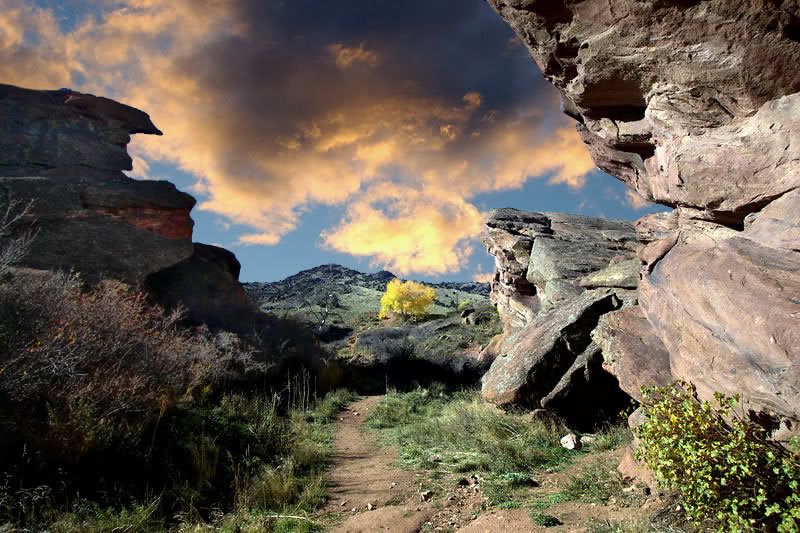
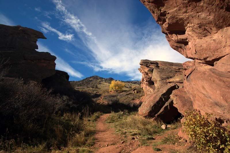
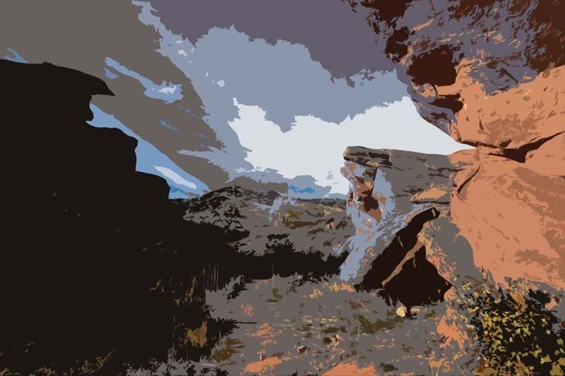
Sun Oct-08-06 03:00 PM
Response to Original message
22. Wowza!!!!
Edited on Sun Oct-08-06 03:04 PM by F.Gordon
Can't believe all the excellent photo editing jobs that everyone did. Each unique.... creative...
:wow:

I feel like mine is weak by comparison but here it is.....

Just use one of the processes above to get a good version of the pic... then this is very simple;

+ copy your corrected version and paste it as a new layer
+ set new layer to "normal"
+ convert that layer to grayscale or desaturate
+ colorize at Hue 25 and Saturation 255
ON Edit: option you would have by doing a layer would be to NOT grayscale/desaturate and use about 70%-80% opacity in the normal layer. This would bring out some of the blue in the sky and greens in the foreground. I elected to remove all the color but you could play with a color version by adjusting your layer.
+ flatten image/layers
+ set Shadow to -40, Midtones to -25, and Highlights to -0-
+ that burning bush? my quick fix was to use a Burn Brush at 60% hardness, 100% density and just paint over it a bit
+ cropped to remove that annoying "dark" side at 1:1 ratio (square) and to give the photo a little better composition... gradiant lighting.... framed with rocks... :crazy:


Thanks for playing along!!!!
:hi:
Printer Friendly | Permalink |  | Top
 
JeffR Donating Member (1000+ posts) Send PM | Profile | Ignore Mon Oct-09-06 10:43 AM
Response to Reply #22
25. What is this "cropping" of which you speak?
:rofl:

Your result has a sort of extraterrestrial feel to it.

Printer Friendly | Permalink |  | Top
 
F.Gordon Donating Member (1000+ posts) Send PM | Profile | Ignore Mon Oct-09-06 12:10 PM
Response to Reply #25
26. Shhhhh..... ummm.... I don't do crop
:evilgrin:

Three "normal" variations. One using Silkypix, one with Paint Shop Pro, and one B&W using a fake silver toning "developing".


Printer Friendly | Permalink |  | Top
 
JeffR Donating Member (1000+ posts) Send PM | Profile | Ignore Mon Oct-09-06 08:36 PM
Response to Reply #26
28. I like the grayscale version
But I like the second color one because it preserves the sense of looking into deep distance but manages to make the scale a mystery.

Printer Friendly | Permalink |  | Top
 
ConsAreLiars Donating Member (1000+ posts) Send PM | Profile | Ignore Sun Oct-08-06 11:05 PM
Response to Original message
24. Using Picture Windows Pro
Thanks for posting this challenge. It was fun to play with. I learned a bit more about the software I use, and although the tweaking took less time than the writing about it, both were more fun than doing the stuff I ought to be doing.

I first converted the file from 24 bits to 48 bits in order to avoid rounding errors and potential artifacting when the numbers get crunched.

I first made masks to isolate three areas of particular interest:

M1- Using the Brightness Curve Tool to select the deepest shadow areas:


M2- Using the Color Range Tool to select the yellow bushes, and then painting the mask as needed to make sure all the bushes were included but nothing else.


M3- Again used the Color Range Tool and painting as needed to segregate the blue sky.


Step 0: First, the original (reduced).


Step 1: I then applied the "Gray/Levels and Color" transformation on the shadow areas through the mask M1 to bring up the midtones in those are (about 30%)and extend the range of values up to around 95%, up from the 80% dynamic range in the original, and reduced the saturation in that area by about 10% (it is a shadow area after all). (All in the default HSV color space.)


Step 2: I then used the same mask (reversed) and transformation to operate on the non-shadow area. I brought down (darkened) the midtones, increased the dynamic range from 80% to 90%, and kicked the Saturation up by 52% (using the HSL color space.) This is Step 2:


Step 3: I then used the 2nd Mask to enhance the yellow bushes. (I also cloned out a few white specks that had been distracting -- should have done this sooner.) I used the Color/Curves Transformation to give a small boost to the Luminance and Saturation values in HSL color space.


Step 4: I then sharpened the original larger image, using Unsharp Masking, using the sky mask M3 (reversed) to avoid the commonly seen white line along the horizon, reduced to 800 pixel width, and then used the same mask with Advanced sharpen (noise reduction (blur) and speck removal set to zero) (radius at .74 pixels and amount at 75%) for the final (less one) tweak. I then used the the yellow bush mask M3 to give it a bit more with glitter using Advanced Sharpening (radius 1.1 at 90%).

This is the result I got:


(Thanks to http://xs.to/ for the free , no frills, no surprises, hosting service.)

Of course, any of these steps could have been taken a bit further, going Bozo with the colors, but those goes a bit further into the surreal than I find comfortable.
Printer Friendly | Permalink |  | Top
 
Touchdown Donating Member (1000+ posts) Send PM | Profile | Ignore Mon Oct-09-06 08:13 PM
Response to Original message
27. Ok Bucko! Here's mine.
PSE 2...

Auto Contrast
Remove Blue x2 in color variations
Smudged that nasty jet trail outta there with 96% intensity, and smoothed it out with 40% intensity.


This one I did the "Cutout" filter. How much the levels are is an Ancient Chinese Secret.

Printer Friendly | Permalink |  | Top
 
DU AdBot (1000+ posts) Click to send private message to this author Click to view 
this author's profile Click to add 
this author to your buddy list Click to add 
this author to your Ignore list Thu Apr 25th 2024, 01:18 AM
Response to Original message
Advertisements [?]
 Top

Home » Discuss » DU Groups » Arts & Entertainment » Photography Group Donate to DU

Powered by DCForum+ Version 1.1 Copyright 1997-2002 DCScripts.com
Software has been extensively modified by the DU administrators


Important Notices: By participating on this discussion board, visitors agree to abide by the rules outlined on our Rules page. Messages posted on the Democratic Underground Discussion Forums are the opinions of the individuals who post them, and do not necessarily represent the opinions of Democratic Underground, LLC.

Home  |  Discussion Forums  |  Journals |  Store  |  Donate

About DU  |  Contact Us  |  Privacy Policy

Got a message for Democratic Underground? Click here to send us a message.

© 2001 - 2011 Democratic Underground, LLC