http://chartjunk.karmanaut.com/taxplans/Tax Plans (thats one for you, nineteen for me).UPDATE: Heres a PDF version of my redrawn tax plan chart.
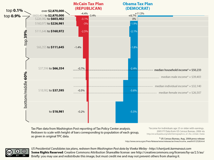
Theres a graph that Obama supporters are sending around, showing the differences between the Republican and Democrat tax cut proposals. It shows that Obama is not in fact planning to raise taxes - hes planning to cut them for all but the very, very rich. I couldnt help but notice though - the graph is still massively weighted towards the interests of the super-rich. For example, the bottom two-thirds of the population are given only a third of the space on the graph, while the top 0.1% of the population - one in a thousand people - gets almost 10%. Whats more, an average tax cut is then given, which seems to have been derived from taking a total of the nine income brackets shown and dividing it by nine. Journalists should really volunteer to take remedial arithmetic, you know. Once again, this ignores that one of the brackets represents one thousandth of the population.
So lets make this a bit more accurate - lets keep all the brackets, but draw it to scale.
(cc) US Tax Plans - Redrawing by Viveka Weiley is licensed under a Creative Commons Attribution-Share Alike 2.5 Australia License.
My redrawing is not perfect - I dont know the detailed income distributions, only that the bottom three brackets equal 60% of the population, the next four are 39%, the next 1% and the next 0.1% (to make a total of 100.01%, but never mind) - but with some help from commenters (particularly zach) its becoming pretty good - the height of each bar now correctly reflects the source data. Also notice that even with my redrawing, median income (where Obama is proposing a sevenfold larger tax cut than McCain) is not in the middle, its down in the second or third-bottom bracket. This reflects the concentration of wealth at the top, as commenters have helpfully pointed out below.
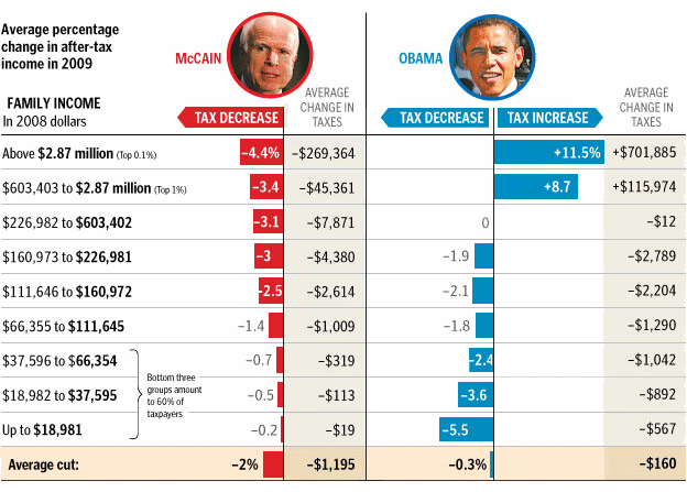
Nonetheless it is a considerably truthier picture than the Washington Post version, which I reproduce below for comparison.
MORE POST, LINKS & COMMENTS AT ORIGINAL LINK