| Latest | Greatest | Lobby | Journals | Search | Options | Help | Login |
|
|
|
This topic is archived. |
| Home » Discuss » Archives » General Discussion (1/22-2007 thru 12/14/2010) |
|
| JackRiddler
|
Tue Sep-23-08 09:18 PM Original message |
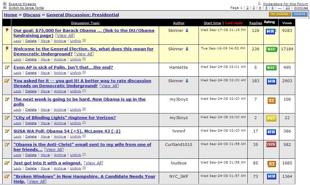
| Do you guys mind moving the ratings column to the right side? |
| Printer Friendly | Permalink | | Top |
| RainDog
|
Tue Sep-23-08 09:21 PM Response to Original message |
| 1. second |
| Printer Friendly | Permalink | | Top |
| SpiralHawk
|
Wed Sep-24-08 07:40 AM Response to Reply #1 |
| 28. Third, or whatever. It is too big and too distracting as is... |
| Printer Friendly | Permalink | | Top |
| patrice
|
Tue Sep-23-08 09:24 PM Response to Original message |
| 2. Or - how about the middle? |
| Printer Friendly | Permalink | | Top |
| halobeam
|
Tue Sep-23-08 09:25 PM Response to Original message |
| 3. third! |
| Printer Friendly | Permalink | | Top |
| Gidney N Cloyd
|
Tue Sep-23-08 09:29 PM Response to Original message |
| 4. Agreed. |
| Printer Friendly | Permalink | | Top |
| JackRiddler
|
Tue Sep-23-08 11:22 PM Response to Original message |
| 5. Kicking's still allowed, no? |
| Printer Friendly | Permalink | | Top |
| bigmonkey
|
Tue Sep-23-08 11:44 PM Response to Original message |
| 6. Agree /nt |
| Printer Friendly | Permalink | | Top |
| arthritisR_US
|
Tue Sep-23-08 11:49 PM Response to Original message |
| 7. phew, I thought I was the only one encumbered by it. Thanks! n/t |
| Printer Friendly | Permalink | | Top |
| uppityperson
|
Tue Sep-23-08 11:52 PM Response to Original message |
| 8. I agree, I'd like it back where "recs" used to be, makes it difficult to read headlines |
| Printer Friendly | Permalink | | Top |
| Flabbergasted
|
Tue Sep-23-08 11:57 PM Response to Original message |
| 9. It's all habit. The change is good. nt |
| Printer Friendly | Permalink | | Top |
| KittyWampus
|
Wed Sep-24-08 10:11 AM Response to Reply #9 |
| 40. So if someone puts a pile of dog crap in front of your front door every morning |
| Printer Friendly | Permalink | | Top |
| TahitiNut
|
Tue Sep-23-08 11:59 PM Response to Original message |
| 10. Either to the right ... or trailing the 'ignore thread' box. It's far too clumsy where it is. |
| Printer Friendly | Permalink | | Top |
| lpbk2713
|
Wed Sep-24-08 12:02 AM Response to Original message |
| 11. Agree |
| Printer Friendly | Permalink | | Top |
| Quantess
|
Wed Sep-24-08 02:14 AM Response to Original message |
| 12. Yes, I agree. |
| Printer Friendly | Permalink | | Top |
| Raine
|
Wed Sep-24-08 02:26 AM Response to Original message |
| 13. Agree ... |
| Printer Friendly | Permalink | | Top |
| krispos42
|
Wed Sep-24-08 02:35 AM Response to Original message |
| 14. I propose something like this: |
| Printer Friendly | Permalink | | Top |
| SeattleGirl
|
Wed Sep-24-08 02:36 AM Response to Reply #14 |
| 15. Oh, I like that! |
| Printer Friendly | Permalink | | Top |
| krispos42
|
Wed Sep-24-08 02:52 AM Response to Reply #15 |
| 18. Thanks |
| Printer Friendly | Permalink | | Top |
| greyl
|
Wed Sep-24-08 02:59 AM Response to Reply #14 |
| 19. Narrower rating labels might be better to conserve space, but not on the right side. |
| Printer Friendly | Permalink | | Top |
| KittyWampus
|
Wed Sep-24-08 10:37 AM Response to Reply #19 |
| 51. actually, putting them on the right side helps those of us who find them irrelevant |
| Printer Friendly | Permalink | | Top |
| greyl
|
Wed Sep-24-08 01:06 PM Response to Reply #51 |
| 54. Right. |
| Printer Friendly | Permalink | | Top |
| anakie
|
Wed Sep-24-08 06:24 AM Response to Reply #14 |
| 24. this is pretty good |
| Printer Friendly | Permalink | | Top |
| krispos42
|
Wed Sep-24-08 09:41 AM Response to Reply #24 |
| 35. Those are moderator functions |
| Printer Friendly | Permalink | | Top |
| noamnety
|
Wed Sep-24-08 06:16 PM Response to Reply #35 |
| 56. darn |
| Printer Friendly | Permalink | | Top |
| eowyn_of_rohan
|
Wed Sep-24-08 07:44 AM Response to Reply #14 |
| 29. Better, layout but I think there are too many categories |
| Printer Friendly | Permalink | | Top |
| OmmmSweetOmmm
|
Wed Sep-24-08 08:32 AM Response to Reply #14 |
| 34. Much better. :) |
| Printer Friendly | Permalink | | Top |
| halobeam
|
Wed Sep-24-08 10:01 AM Response to Reply #14 |
| 36. MUCH better.... |
| Printer Friendly | Permalink | | Top |
| KittyWampus
|
Wed Sep-24-08 10:12 AM Response to Reply #14 |
| 42. I love you for doing that, thanks. The Admins have created such a great forum. Easy to use |
| Printer Friendly | Permalink | | Top |
| Karenina
|
Wed Sep-24-08 10:22 AM Response to Reply #14 |
| 46. YES! PERFECT!!! With more subdued colors than the subject line!!! |
| Printer Friendly | Permalink | | Top |
| chill_wind
|
Wed Sep-24-08 11:05 AM Response to Reply #14 |
| 53. I like that better, if we must have this at all. |
| Printer Friendly | Permalink | | Top |
| ConsAreLiars
|
Wed Sep-24-08 02:50 AM Response to Original message |
| 16. Agreed |
| Printer Friendly | Permalink | | Top |
| EFerrari
|
Wed Sep-24-08 02:51 AM Response to Original message |
| 17. I thought it was just me. n/t |
| Printer Friendly | Permalink | | Top |
| Solly Mack
|
Wed Sep-24-08 03:13 AM Response to Original message |
| 20. Yes, please. |
| Printer Friendly | Permalink | | Top |
| Jeroen
|
Wed Sep-24-08 03:24 AM Response to Original message |
| 21. Agreed n/t |
| Printer Friendly | Permalink | | Top |
| riverdeep
|
Wed Sep-24-08 04:23 AM Response to Original message |
| 22. I like it. |
| Printer Friendly | Permalink | | Top |
| conspirator
|
Wed Sep-24-08 04:54 AM Response to Original message |
| 23. My eyes actually hurt with all the colors. Move to the right and make them smaller |
| Printer Friendly | Permalink | | Top |
| OneGrassRoot
|
Wed Sep-24-08 07:25 AM Response to Reply #23 |
| 27. Ditto. n/t |
| Printer Friendly | Permalink | | Top |
| readmoreoften
|
Wed Sep-24-08 06:26 AM Response to Original message |
| 25. If they go to the right it'll be more difficult for folks with small screens. I say keep em left. |
| Printer Friendly | Permalink | | Top |
| Reader Rabbit
|
Wed Sep-24-08 07:00 AM Response to Original message |
| 26. Yes, please! n/t |
| Printer Friendly | Permalink | | Top |
| zippy890
|
Wed Sep-24-08 07:46 AM Response to Original message |
| 30. yes. right side would be better |
| Printer Friendly | Permalink | | Top |
| Tracer
|
Wed Sep-24-08 07:48 AM Response to Original message |
| 31. These things appeared this morning, and I dislike it very much! |
| Printer Friendly | Permalink | | Top |
| Tindalos
|
Wed Sep-24-08 08:27 AM Response to Original message |
| 32. Another reason to move it to the right: |
| Printer Friendly | Permalink | | Top |
| OmmmSweetOmmm
|
Wed Sep-24-08 08:31 AM Response to Original message |
| 33. I agree. I seems to also make the ratings more important than the subject itself. |
| Printer Friendly | Permalink | | Top |
| KoKo
|
Wed Sep-24-08 10:08 AM Response to Reply #33 |
| 39. Exactly....n/t |
| Printer Friendly | Permalink | | Top |
| madfloridian
|
Wed Sep-24-08 10:05 AM Response to Original message |
| 37. I miss so many good posts with it on the left. Very distracting. |
| Printer Friendly | Permalink | | Top |
| KoKo
|
Wed Sep-24-08 10:07 AM Response to Original message |
| 38. How about using "emoticons" instead of the current system for Rec's, too. |
| Printer Friendly | Permalink | | Top |
| Subdivisions
|
Wed Sep-24-08 10:11 AM Response to Original message |
| 41. Agreed. n/t |
| Printer Friendly | Permalink | | Top |
| Naturyl
|
Wed Sep-24-08 10:12 AM Response to Original message |
| 43. Agreed. |
| Printer Friendly | Permalink | | Top |
| buzzard
|
Wed Sep-24-08 10:12 AM Response to Original message |
| 44. I would like the option of hiding it, I have always liked the format here |
| Printer Friendly | Permalink | | Top |
| hunter
|
Wed Sep-24-08 10:17 AM Response to Original message |
| 45. Make them characters or smilies-- |
| Printer Friendly | Permalink | | Top |
| chill_wind
|
Wed Sep-24-08 10:28 AM Response to Reply #45 |
| 49. Smilies----- noooooooohhh! LOL! |
| Printer Friendly | Permalink | | Top |
| Chan790
|
Wed Sep-24-08 10:22 AM Response to Original message |
| 47. Perhaps this should have been a poll? n/m |
| Printer Friendly | Permalink | | Top |
| Arugula Latte
|
Wed Sep-24-08 10:26 AM Response to Original message |
| 48. Yes! Pleeeeease? |
| Printer Friendly | Permalink | | Top |
| Sewsojm
|
Wed Sep-24-08 10:29 AM Response to Original message |
| 50. Ditto |
| Printer Friendly | Permalink | | Top |
| Tommy_Carcetti
|
Wed Sep-24-08 10:38 AM Response to Original message |
| 52. Agreed. It's annoying in its current set up. N/t |
| Printer Friendly | Permalink | | Top |
| uppityperson
|
Wed Sep-24-08 06:08 PM Response to Original message |
| 55. Thanks admin! It is much better over there. |
| Printer Friendly | Permalink | | Top |
| DU
AdBot (1000+ posts) |
Mon May 06th 2024, 05:41 AM Response to Original message |
| Advertisements [?] |
| Top |
| Home » Discuss » Archives » General Discussion (1/22-2007 thru 12/14/2010) |
|
Powered by DCForum+ Version 1.1 Copyright 1997-2002 DCScripts.com
Software has been extensively modified by the DU administrators
Important Notices: By participating on this discussion board, visitors agree to abide by the rules outlined on our Rules page. Messages posted on the Democratic Underground Discussion Forums are the opinions of the individuals who post them, and do not necessarily represent the opinions of Democratic Underground, LLC.
Home | Discussion Forums | Journals | Store | Donate
About DU | Contact Us | Privacy Policy
Got a message for Democratic Underground? Click here to send us a message.
© 2001 - 2011 Democratic Underground, LLC