| Latest | Greatest | Lobby | Journals | Search | Options | Help | Login |
|
|
|
This topic is archived. |
| Home » Discuss » Archives » General Discussion (1/22-2007 thru 12/14/2010) |
|
| HughMoran
|
Fri May-07-10 10:02 PM Original message |
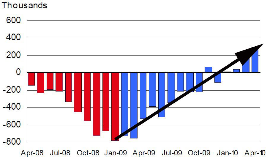
| Updated month over month nonfarm payroll employment chart (as shown on Rachels show) |
| Printer Friendly | Permalink | | Top |
| tonysam
|
Fri May-07-10 10:15 PM Response to Original message |
| 1. That doesn't begin to cover the massive numbers of unemployed |
| Printer Friendly | Permalink | | Top |
| WeDidIt
|
Fri May-07-10 10:23 PM Response to Reply #1 |
| 2. Fixing eight years of the Republcians completely FUCKING the middle class will take time |
| Printer Friendly | Permalink | | Top |
| scheming daemons
|
Fri May-07-10 10:26 PM Response to Reply #1 |
| 3. Actually... mathematically... it DOES "begin" to cover it |
| Printer Friendly | Permalink | | Top |
| HughMoran
|
Fri May-07-10 10:32 PM Response to Reply #3 |
| 4. Did I have to draw in a linear interpolation line showing the steady upward slope? |
| Printer Friendly | Permalink | | Top |
| scheming daemons
|
Fri May-07-10 10:38 PM Response to Reply #4 |
| 5. There is no logical argument.... some people are emotionally invested in our country failing |
| Printer Friendly | Permalink | | Top |
| HughMoran
|
Fri May-07-10 10:44 PM Response to Reply #5 |
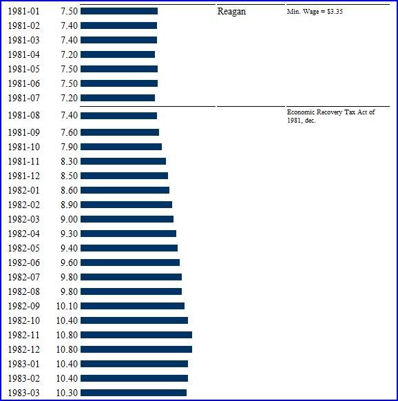
| 7. Look what happened after Reagan passed his stimulus package of tax cuts -> |
| Printer Friendly | Permalink | | Top |
| Brickbat
|
Fri May-07-10 10:39 PM Response to Original message |
| 6. I really dislike that chart. |
| Printer Friendly | Permalink | | Top |
| karynnj
|
Fri May-07-10 10:51 PM Response to Reply #6 |
| 8. I disagree |
| Printer Friendly | Permalink | | Top |
| scheming daemons
|
Fri May-07-10 10:52 PM Response to Reply #6 |
| 9. The chart clearly shows how many jobs were lost.... |
| Printer Friendly | Permalink | | Top |
| HughMoran
|
Fri May-07-10 11:03 PM Response to Reply #9 |
| 10. Here, I improved it to show the linear direction of the chart and the red of Bush |
| Printer Friendly | Permalink | | Top |
| HughMoran
|
Fri May-07-10 11:19 PM Response to Reply #6 |
| 11. It isn't designed to show that number |
| Printer Friendly | Permalink | | Top |
| DU
AdBot (1000+ posts) |
Fri Apr 26th 2024, 01:27 AM Response to Original message |
| Advertisements [?] |
| Top |
| Home » Discuss » Archives » General Discussion (1/22-2007 thru 12/14/2010) |
|
Powered by DCForum+ Version 1.1 Copyright 1997-2002 DCScripts.com
Software has been extensively modified by the DU administrators
Important Notices: By participating on this discussion board, visitors agree to abide by the rules outlined on our Rules page. Messages posted on the Democratic Underground Discussion Forums are the opinions of the individuals who post them, and do not necessarily represent the opinions of Democratic Underground, LLC.
Home | Discussion Forums | Journals | Store | Donate
About DU | Contact Us | Privacy Policy
Got a message for Democratic Underground? Click here to send us a message.
© 2001 - 2011 Democratic Underground, LLC