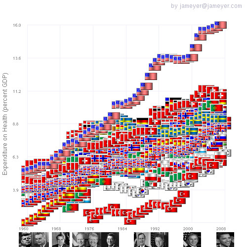
Health Care Costs as a percent of GDP vs Year with US Presidential Terms
Health care costs as percent of GDP vs year along with US presidential terms. This data graphic shows that before the 1980s the US was not terribly out of line with other OECD countries. US health care costs spiked in remarkably similar way with both Bush presidencies.
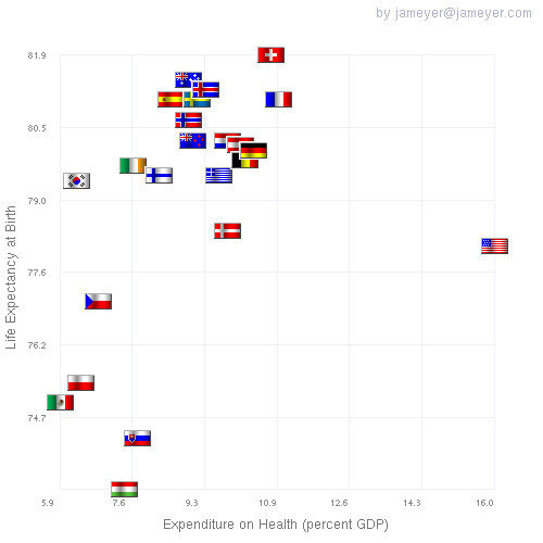
Life Expectancy vs Health Care Cost (as percent of GDP)
This flag scatter plot shows life expectancy vs the percent of GDP spend on health care. The US spends a much higher percent than other OECD countries and yet has medium life expectancy. All OECD countries expect Mexico and the US have some form of single payer health care.
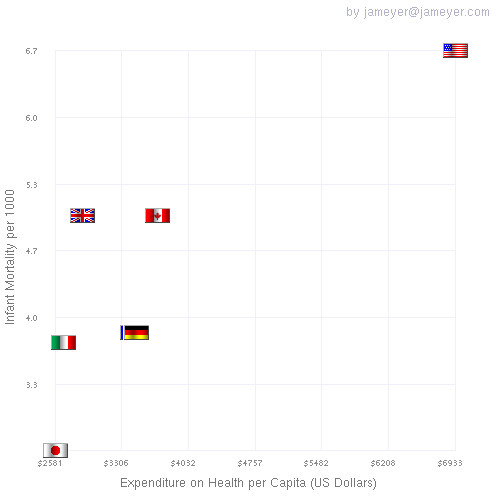
infant mortality vs total spending on health care
Infant mortality per 1000 vs heath care spending for the G8 countries.
http://www.flickr.com/photos/47179524@N02/