| Latest | Greatest | Lobby | Journals | Search | Options | Help | Login |
|
|
|
This topic is archived. |
| Home » Discuss » General Discussion |
|
| Hissyspit
|
Sat Oct-01-11 11:33 PM Original message |
| Hi, DU, A Favor: Graphs Showing The Changing Economic Situation in U.S. |
| Printer Friendly | Permalink | | Top |
| PETRUS
|
Sat Oct-01-11 11:39 PM Response to Original message |
| 1. I'm too lazy to root for the graphs, but |
| Printer Friendly | Permalink | | Top |
| Hissyspit
|
Sat Oct-01-11 11:51 PM Response to Reply #1 |
| 2. Thanks, that's a start. |
| Printer Friendly | Permalink | | Top |
| HCE SuiGeneris
|
Sun Oct-02-11 12:05 AM Response to Original message |
| 3. I'm graphless tonight, but would like to heartily K & R this thread... |
| Printer Friendly | Permalink | | Top |
| chill_wind
|
Sun Oct-02-11 12:12 AM Response to Original message |
| 4. Shadowstats |
| Printer Friendly | Permalink | | Top |
| Hissyspit
|
Sun Oct-02-11 12:16 AM Response to Reply #4 |
| 5. Thanks! |
| Printer Friendly | Permalink | | Top |
| chill_wind
|
Sun Oct-02-11 01:13 AM Response to Reply #5 |
| 7. Consumer/Household Liquidity |
| Printer Friendly | Permalink | | Top |
| Hissyspit
|
Sun Oct-02-11 02:04 AM Response to Reply #7 |
| 10. Yipes. |
| Printer Friendly | Permalink | | Top |
| chill_wind
|
Sun Oct-02-11 02:10 AM Response to Reply #10 |
| 11. The last 30 years in the labor market in one graph |
| Printer Friendly | Permalink | | Top |
| Hissyspit
|
Sun Oct-02-11 12:20 AM Response to Original message |
| 6. Stuff like this: |
| Printer Friendly | Permalink | | Top |
| chill_wind
|
Sun Oct-02-11 01:57 AM Response to Reply #6 |
| 8. State of Working America |
| Printer Friendly | Permalink | | Top |
| Hissyspit
|
Sun Oct-02-11 02:04 AM Response to Reply #8 |
| 9. Excellent. |
| Printer Friendly | Permalink | | Top |
| Ichingcarpenter
|
Sun Oct-02-11 02:15 AM Response to Original message |
| 12. I found this map |
| Printer Friendly | Permalink | | Top |
| Spider Jerusalem
|
Sun Oct-02-11 03:00 AM Response to Reply #12 |
| 16. That map actually shows something else if you know what you're looking at |
| Printer Friendly | Permalink | | Top |
| Ichingcarpenter
|
Sun Oct-02-11 03:04 AM Response to Reply #16 |
| 17. submit something your self... Go ahead |
| Printer Friendly | Permalink | | Top |
| ljm2002
|
Sun Oct-02-11 02:38 AM Response to Original message |
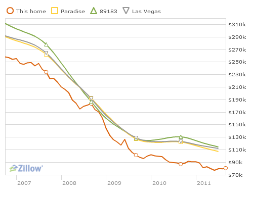
| 13. I got this on zillow.com... |
| Printer Friendly | Permalink | | Top |
| Hissyspit
|
Sun Oct-02-11 05:11 AM Response to Reply #13 |
| 20. Nice. |
| Printer Friendly | Permalink | | Top |
| woo me with science
|
Sun Oct-02-11 02:39 AM Response to Original message |
| 14. I'm sure you have these already, since this was your post, but just in case... |
| Printer Friendly | Permalink | | Top |
| Hissyspit
|
Sun Oct-02-11 05:17 AM Response to Reply #14 |
| 21. Ha, I think I was the one who originally posted that article at DU |
| Printer Friendly | Permalink | | Top |
| woo me with science
|
Sun Oct-02-11 10:47 AM Response to Reply #21 |
| 25. LOL |
| Printer Friendly | Permalink | | Top |
| woo me with science
|
Sun Oct-02-11 02:44 AM Response to Original message |
| 15. Also, workers' share of national income |
| Printer Friendly | Permalink | | Top |
| Smarmie Doofus
|
Sun Oct-02-11 03:22 AM Response to Original message |
| 18. Bookmarked. Thanks. n/t |
| Printer Friendly | Permalink | | Top |
| scarletwoman
|
Sun Oct-02-11 03:27 AM Response to Original message |
| 19. No graphs at hand, but here's my k&r. nt |
| Printer Friendly | Permalink | | Top |
| woo me with science
|
Sun Oct-02-11 10:39 AM Response to Original message |
| 22. A collection of graphs on "overworked America" - patterns in jobs and productivity |
| Printer Friendly | Permalink | | Top |
| woo me with science
|
Sun Oct-02-11 10:42 AM Response to Original message |
| 23. Real versus imagined wealth distribution in America |
| Printer Friendly | Permalink | | Top |
| woo me with science
|
Sun Oct-02-11 10:46 AM Response to Original message |
| 24. Here is a huge collection of charts, not all on this subject, but |
| Printer Friendly | Permalink | | Top |
| Hissyspit
|
Sun Oct-02-11 04:35 PM Response to Original message |
| 26. Thanks, everyone. Good stuff! |
| Printer Friendly | Permalink | | Top |
| chill_wind
|
Mon Oct-03-11 02:05 AM Response to Original message |
| 27. Connect The Dots USA |
| Printer Friendly | Permalink | | Top |
| Major Nikon
|
Mon Oct-03-11 04:13 AM Response to Original message |
| 28. Historic tax rates by income group, 1960-2004 |
| Printer Friendly | Permalink | | Top |
| Hissyspit
|
Mon Oct-03-11 05:21 AM Response to Reply #28 |
| 30. Thanks! |
| Printer Friendly | Permalink | | Top |
| McCamy Taylor
|
Mon Oct-03-11 04:18 AM Response to Original message |
| 29. Wow. The folks who arranged Hostages for Votes got their money's worth. |
| Printer Friendly | Permalink | | Top |
| Hissyspit
|
Mon Oct-03-11 12:53 PM Response to Original message |
| 31. Anybody else? |
| Printer Friendly | Permalink | | Top |
| chill_wind
|
Mon Oct-03-11 07:08 PM Response to Original message |
| 32. Duer thread: |
| Printer Friendly | Permalink | | Top |
| Hissyspit
|
Tue Oct-04-11 11:32 PM Response to Reply #32 |
| 33. Yeah, I saw that, thanks. |
| Printer Friendly | Permalink | | Top |
| DU
AdBot (1000+ posts) |
Fri Apr 26th 2024, 07:24 AM Response to Original message |
| Advertisements [?] |
| Top |
| Home » Discuss » General Discussion |
|
Powered by DCForum+ Version 1.1 Copyright 1997-2002 DCScripts.com
Software has been extensively modified by the DU administrators
Important Notices: By participating on this discussion board, visitors agree to abide by the rules outlined on our Rules page. Messages posted on the Democratic Underground Discussion Forums are the opinions of the individuals who post them, and do not necessarily represent the opinions of Democratic Underground, LLC.
Home | Discussion Forums | Journals | Store | Donate
About DU | Contact Us | Privacy Policy
Got a message for Democratic Underground? Click here to send us a message.
© 2001 - 2011 Democratic Underground, LLC