Welcome to DU!
The truly grassroots left-of-center political community where regular people, not algorithms, drive the discussions and set the standards.
Join the community:
Create a free account
Support DU (and get rid of ads!):
Become a Star Member
Latest Breaking News
General Discussion
The DU Lounge
All Forums
Issue Forums
Culture Forums
Alliance Forums
Region Forums
Support Forums
Help & Search
General Discussion
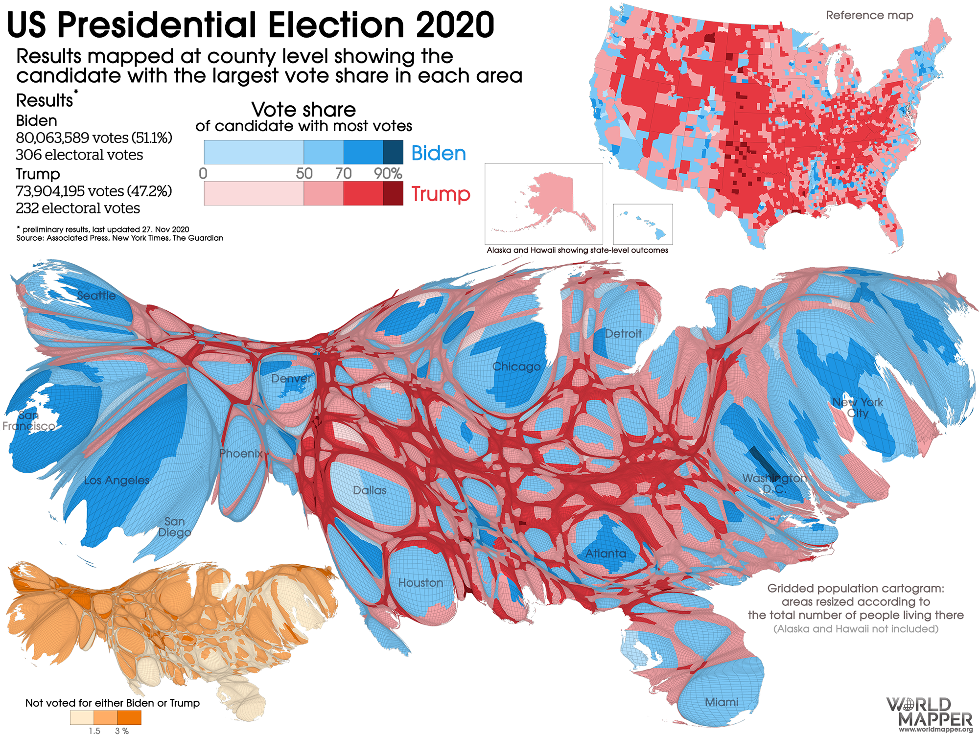
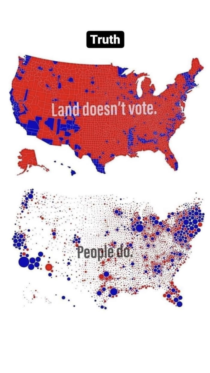
Related: Editorials & Other Articles, Issue Forums, Alliance Forums, Region Forumsit would be nice if the red/blue election map could be replaced with some sort of easy-to-read . . .
. . . population-related weighted graphic.
A densely populated urban county compared to a rural county with more cows than people reads graphically like a GZP landslide.
InfoView thread info, including edit history
TrashPut this thread in your Trash Can (My DU » Trash Can)
BookmarkAdd this thread to your Bookmarks (My DU » Bookmarks)
6 replies, 626 views
ShareGet links to this post and/or share on social media
AlertAlert this post for a rule violation
PowersThere are no powers you can use on this post
EditCannot edit other people's posts
ReplyReply to this post
EditCannot edit other people's posts
Rec (5)
ReplyReply to this post
6 replies
 = new reply since forum marked as read
Highlight:
NoneDon't highlight anything
5 newestHighlight 5 most recent replies
= new reply since forum marked as read
Highlight:
NoneDon't highlight anything
5 newestHighlight 5 most recent replies
= new reply since forum marked as read
Highlight:
NoneDon't highlight anything
5 newestHighlight 5 most recent replies
it would be nice if the red/blue election map could be replaced with some sort of easy-to-read . . . (Original Post)
Stinky The Clown
Dec 2022
OP
onecaliberal
(32,864 posts)1. Land doesn't equal people.

AZSkiffyGeek
(11,029 posts)2. NYT has the "votes outstanding" map
Highlights where the biggest pools of voters are - that kinda helps...

ZZenith
(4,124 posts)5. Here it is...

bamagal62
(3,264 posts)3. True.
Most of GA pop is in the Atlanta metro area and maybe the the Columbus area. I have family in both North GA and South GA. More land than people for sure.

ret5hd
(20,500 posts)4. Like this?

Wednesdays
(17,381 posts)6. Like this?