General Discussion
Related: Editorials & Other Articles, Issue Forums, Alliance Forums, Region ForumsThe US Government Would Save $400 Million If It Just Switched Typefaces
http://i.kinja-img.com/gawker-media/image/upload/s--XFQttu_5--/c_fit,w_636/ye4rnie5bjhvmpmwokjz.jpgOf the many schemes to make the government more efficient, this is probably the only one that involves typography. A middle schooler in Pittsburgh has calculated that by simply switching the typeface used in government documents from Times New Roman to Garamond, it would save taxpayers $400 million in ink.
Suvir Mirchandani was inspired by an earlier project looking at how to save ink in teacher handouts. He recorded the ink usage of four different fonts—Garamond, Times New Roman, Century Gothic and Comic Sans—and found that Garamond's thin strokes would save his school district 24 percent in ink
Then he decided to apply his results to a bigger scale: the U.S. government. He sampled documents from different government agencies and dug through printing budgets.
full: http://gizmodo.com/the-us-government-would-save-400-million-if-it-just-sw-1553855397
 = new reply since forum marked as read
Highlight:
NoneDon't highlight anything
5 newestHighlight 5 most recent replies
= new reply since forum marked as read
Highlight:
NoneDon't highlight anything
5 newestHighlight 5 most recent replies
1000words
(7,051 posts)

Wait Wut
(8,492 posts)It depends on the fonts. Many serif fonts are actually thinner than sans serifs.
immoderate
(20,885 posts)--imm

Wounded Bear
(58,649 posts)There are readability issues there.
OTOH, studies like this, while they may seem frivolous, actually give me hope for the future. After all, there has been a tsunami of new fonts realeased in the last 30 years or so as printers have been modernised. Evaluating which is best overall in cost vs readability sounds like a good idea to do on a periodic basis.
One other question: Does this apply to toner as well? Old fashioned ink printing has been declining a bit since the advent of the laser and inkjet lines. Most local office based printing is done on lasers and inkjets, I presume.
And a further follow up: Is there a tooling cost associated with font changes? While I suppose most printing is no longer done with Gutenburg-style movable type blocks, there still might be costs associated with the change over. I wonder if the kid included those costs.
ChisolmTrailDem
(9,463 posts)
cyberswede
(26,117 posts)

jmowreader
(50,557 posts)Most of what they use isn't Times anyway...Century is a popular one.

KansDem
(28,498 posts)[font size="2"]Times New Roman: [FONT FACE="timesnewroman"]Time for some traffic problems in Fort Lee. Got it.[/FONT]
Garamond: [FONT FACE="garamond"]Time for some traffic problems in Fort Lee. Got it.[/FONT]
Yeah! It works! And it could save the states a lot of money too! 


Good one


QC
(26,371 posts)I still recommend this thread!
FarCenter
(19,429 posts)You can save both paper and ink by printing using the International Phonetic Alphabet. There are fewer sounds per word than English letters. Plus, it makes pronunciation of a word unambiguous. Read, for example, becomes either red or rēd, which saves an "a" of paper and ink.

hunter
(38,311 posts)Wrds r mch shrtr wtht vwls.
Cooley Hurd
(26,877 posts)That would be $250/vowel they could take home! 
FarCenter
(19,429 posts)A few weeks ago, the news showed a video of stacks of the printed budget being handed out to members of Congress, etc.
Totally useless -- they won't enact it, much less read it. Might as well have saved the expense and materials. And having leafed through one some time ago, it is not clear from the printed budget what we would be getting for the money.
BlueStreak
(8,377 posts)would probably save billions because we could eliminate a bunch of positions "BS artist grade 9" etc.
fascisthunter
(29,381 posts)Maedhros
(10,007 posts)The military budget would be increased by $400 million by switching typefaces.

BlueStreak
(8,377 posts)by mixing it into their toner. They need to print all those documents to get rid of the stuff.
Cooley Hurd
(26,877 posts)Very easy to read. 

Blue_Tires
(55,445 posts)
mahannah
(893 posts)
LiberalAndProud
(12,799 posts)I wonder how Arial stacks up, as that's been my favorite for years now.
muriel_volestrangler
(101,311 posts)Does it require a license?
BlueStreak
(8,377 posts)
Treant
(1,968 posts)Those of us with visual problems have a much easier time reading Times New Roman than many other fonts. If you really want to increase calls (and the personnel required to handle them), do this.
Particularly do this on all Social Security forms, because old people have such great eyes.
The reason is that the letters are a little thicker, making it much easier to read the text when the lighting isn't optimal or the paper is cheap. And the pitching on Times New Roman seems to be a little larger than the Garamond.
Two, the actual savings is $136 million per year, not $400 million for Federal only, and a total of $370 million only if all state governments came on board.

malthaussen
(17,194 posts)I see from comments upthread I'm not alone.
Garamond might well be too thin for over-forty eyes to read comfortably.
-- Mal

freshwest
(53,661 posts)
Optima:
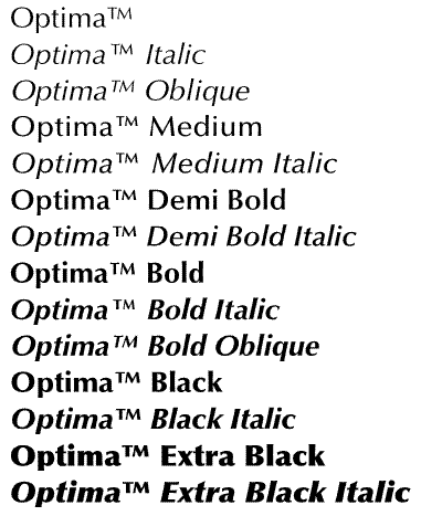
Hate reading Roman font but Garamond is better. Optima would use less ink, too. Arial gives me a different problem than Roman so I avoid it. I can read faster using Optima, as it relieves my astigmatism. It just works for me personally.
Here is an example of what is being used online by the OJP:
http://ojp.gov/
I don't know how government documents are printed, if it's a more archaic method or not, but the font could be changed through the computer system that originates them, as I can change the font of anything before I print it.
This is good thinking by the middle schooler. Not familiar with mass document mailings.
Wonder if they'll change it?
Jim Lane
(11,175 posts)In some appellate courts, which tend to be staffed by older judges, the court rules require that briefs be submitted in 14-point type. Also, sorry to upset you Arial fans, but they require use of a serif font. I vaguely recall that some experts who did studies found that a serif font was generally easier to read.