General Discussion
Related: Editorials & Other Articles, Issue Forums, Alliance Forums, Region ForumsThat median income chart from Kos pretty much proves things are not really getting better.
It puts Dems in an awkward position - we want to be able to be proud of the things Obama and Congress have been able to accomplish, but that chart shows that things are not getting better economically. Something broke in 2008, and we haven't been able to fix it. The safety net might be stronger thanks to Obamacare, extended unemployment, and (maybe) an increased minimum wage. But we should not be pretending as if the economic environment - the ability of families to support themselves - is getting more favorable - because it's not.
 = new reply since forum marked as read
Highlight:
NoneDon't highlight anything
5 newestHighlight 5 most recent replies
= new reply since forum marked as read
Highlight:
NoneDon't highlight anything
5 newestHighlight 5 most recent replies
quinnox
(20,600 posts)I wonder why.
And it is just one indicator of the growing divide, its not like this is news. The rich keep getting richer, the poor and middle class keep losing ground. It needs to change.

upaloopa
(11,417 posts)I think most of us believe we are trending toward oligarchy.

Fumesucker
(45,851 posts)Where the pom poms and the rose colored glasses are color coordinated and only issued to a select Krewe.


ProSense
(116,464 posts)"but that chart shows that things are not getting better economically. "
...really awkward spin using a chart showing that things are "getting better," albeit slowly.
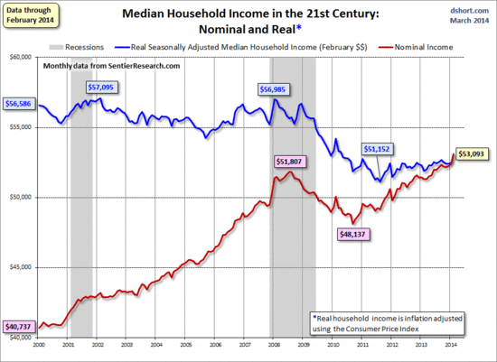
As can be seen, the trend has been upward since late 2010, 16 months after the National Bureau of Economic Research says the Great Recession ended. In fact, as Short notes, the "latest monthly gain was the second largest of the 170 data points in this series since the turn of the century."
http://www.democraticunderground.com/10024777898
IOW, progress is being made, albeit slow, to reverse the declines of the recession. After decades of decline, the "latest monthly gain was the second largest of the 170 data points in this series since the turn of the century."
More from the OP:
"Something broke in 2008, and we haven't been able to fix it. The safety net might be stronger thanks to Obamacare, extended unemployment, and (maybe) an increased minimum wage."
"We haven't been able to fix it" even though you cite things that are fixing it in a big way?

sufrommich
(22,871 posts)as vigorously as it is on conservative sites. Things are getting better,slowly.

Bobbie Jo
(14,341 posts)that conservative sites use DU for Dem-trashing resource material.
Yes, we're steadily moving in the right direction, despite the inability to put forth any sort of meaningful jobs legislation. Had that happened, I have no doubt we would be seeing more substantial progress much sooner.
That we have made any progress at all under these conditions is really quite amazing.
ProSense
(116,464 posts)
chrisa
(4,524 posts)They needed the money more than anything - especially the "Too big to fail" corporations we dumped money on with no oversight.
(Do I need the emoticon here?)

Autumn
(45,082 posts)Yes good things have happened since 2008 but this kind of puts a damper on those things. If the Democrats would try to address this either by doing something or showing the opposition causing this, it would pretty well put a lock on the upcoming elections. Going to check back later and see if you are getting attacked for causing division and trashing Obama.*
*
http://www.democraticunderground.com/10024778085
VanillaRhapsody
(21,115 posts)
jeff47
(26,549 posts)Some folks might think not dying is also a measure of "better". Hey look, lots more people can afford to see a doctor and thus not die.
But that chart is the culmination of 50 years of work. The 'break' you are looking for did not happen in 2008. It happened around 1980. Before then, increased GDP lead to increased real wages. At around 1980, that stopped happening - real wages stopped going up.
That break appears to be due to the rightward turn in our economic policies. It took around 20 years to cause that first turn. And our economic policies were further cranked to the right in the subsequent 30 years.
That can't be undone in 5 years. We're going to have to work at this for a long time.

hfojvt
(37,573 posts)on how you measure "real wages".
And the break seems to have happened in 1977 or so, much as I like to call Reagan "the source of all evil".
The thing is for many workers - we also get health insurance with our jobs. So our real pay is wages + health insurance.
And one of the problems of the last 30 odd years is that the cost of that health insurance part has grown very fast. So if you look at total compensation from an employer perspective, it has grown significantly in the last 30 years. But from a worker perspective it has not.
I am not sure that is all because of a rightward shift in our economic policies. Some of it I might blame on the tying of health insurance to employment and also the tying of health care to health insurance.
But there are probably a lot of other factors involved too - like restrictions on the supply of doctors.
jeff47
(26,549 posts)The correlation between real wages and GDP was never perfect. Over the few decades before 1980 the lines diverge and come back together repeatedly.
The split starting in 1977 could have been part of that statistical noise. Or it could be due to other factors - For example, the right turn started at the state level, then Reagan took it national.
In any case, it's apparent that the "right turn" has maintained the split since.
The charts I'm talking about usually use total compensation, which would include health insurance.
Also, higher insurance costs should be a drag on GDP. Since we're comparing wages to GDP, insurance costs should be somewhat mitigated.
hfojvt
(37,573 posts)did not mention total compensation, and it showed a peak in 1977.
Also, higher insurance costs would likely not be a drag on the GDP. Such is the nature of the GDP.
For one thing, higher costs would be passed on, as much as possible to consumers. Well, higher prices would raise the GDP, not drag it.
Also, the health insurance industry, is PART of the GDP. So the more money they make, that increases their part of the GDP and thus, presumably, the total.
In some ways, that might be a wash since spending $100 million more on health insurance means we collectively have $100 million less to spend on other things. But in other ways it might just mean we have $100 million less in savings or $100 million less in our retirement accounts. Plus, it is $100 million more in income for those who work in the insurance/health industry, so THEY have $100 million MORE to spend.
The GDP is a funny thing, after all. If I cut my own grass, that adds nothing to the GDP. If, however, my expenses are increased because I pay somebody else to cut my grass, that increases the GDP. Unless, of course, I pay him in cash and he does not report it. The underground economy also not being part of the GDP.
jeff47
(26,549 posts)You spend the money buying health insurance instead of buying goods, and the money raises GDP by less than if you spent on goods. Money spent on goods mostly went to suppliers, distributors, and so on. Profit is relatively small. Before the limits on medical loss ratio, a significant chunk of health insurance was padding profits.
Yes, but there were "peaks" before 1977 too. Real wages peaked, then dropped, then peaked again, then dropped again, then peaked again........
1977 was the last peak. We can't say with certainty that the immediate drop was not just another cyclical peak. But is is pretty clear that favoring capital over labor in the subsequent decades has helped keep wages flat.
hfojvt
(37,573 posts)Looking at the chart I see
1. the downward slide of 2008-2011 has stopped.
I claim that "no longer dropping" IS better than "dropping".
It went from 56,000 down to 51,000 in 3.5 years. Now 2.5 years later it is at 53,000 and NOT at 48,000.
2. there has also been a slight increase in the last 2.5 years. Is $53,000 NOT better than $51,000.
and
3. median income does not cover ALL people. Now you are probably thinking "yeah, things are getting better for the 1%". But no, I am thinking of myself, a person in the bottom 20%. Imagine if you put MY income on that chart.
Here that is, in nominal (and real) numbers, by year
2000 - 16,153 (22,023)
2001 - 17,464 (23,152)
2002 - 10,617 (13,856)
2003 - 13,891 (17,725)
2004 - 19,704 (24,490)
2005 - 24,120 (28,996)
2006 - 22,924 (26,697)
2007 - 11,202 (12,684)
2008 - 12,604 (13,744)
2009 - 27,000 (29,548)
2010 - 13,130 (14,137)
2011 - 15,814 (16,506)
2012 - 31,329 (32,037)
2013 - 31,987 (32,237)
You may note that my income is not following the median income, and also that I am still well below the median income.
Further, I would note that there are other factors besides income. In 2000, for example, when I made $16,153, that was for about 2,300 hours of work. In 2003 when I made $13,891 that was for 1,000 hours of work. My income was down by 16% but my hours of work were down by 130%. I call that a net gain.
Same thing from 2006 to 2007, my hours of work were cut in half. If I have my way, I am gonna do that again in 2014.
Again, the obvious point, the median income does not tell you all that much about "all families".

Bettie
(16,105 posts)He was fortunate to find a job after 8 months of being unemployed, but what he found was that wages for the very same job he had, in the field he had worked in for years, were paying at least 10k less annually than they had TEN YEARS before.
He has a great job now, for a company that treats it's employees well, but it was still a substantial pay cut from previous positions (though getting paid overtime makes up the difference most months).
We're also very aware that we were lucky that he found something decent so quickly, especially since we're no longer what you'd call young!

Bonhomme Richard
(9,000 posts)ProSense
(116,464 posts)By Doug Short
March 31, 2014 (Monthly Update)
Summary: The Sentier Research monthly median household income data series is now available for February. Nominal median household incomes were up $668 month-over-month and up $1,787 year-over-year. Adjusted for inflation, they were up 1.2% MoM and 2.4% YoY.
The latest monthly gain was the second largest of the 170 data points in this series since the turn of the century. However, in real dollar terms, the median annual income is 6.8% lower (about $3,892) than its interim high in January 2008.
<...>
The first chart below is an overlay of the nominal values and real monthly values chained in January 2014 dollars. The red line illustrates the history of nominal median household, and the blue line shows the real (inflation-adjusted value). I've added callouts to show specific nominal and real monthly values for January 2000 start date and the peak and post-peak troughs.
In the latest press release, Sentier Research spokesman Gordon Green summarizes the recent data.
This monthly increase in median household income between January and February 2014 extends an uneven but upward trend. Our time series charts clearly illustrate that although the economic recovery officially began in June 2009, the recovery in household income did not begin to emerge until after August 2011. While many of the month-to-month changes in median income since the low-point in August 2011 have not been statistically significant, an overall upward trend is clearly evident.
- more -
http://advisorperspectives.com/dshort/updates/Median-Household-Income-Update.php
Just thought this should be posted with the accompanying facts from the actual source.

reformist2
(9,841 posts)We should focus on new ideas to share the wealth, and Repug obstructionism to those ideas. Any Dem who campaigns by saying that things are actually getting better will and ought to be laughed at by voters.

CJCRANE
(18,184 posts)it kept going down for a while.
The implosion in 2008 wasn't the bottom of the crash, that was the beginning.
It stands to reason that it would take a while before things started getting better again (i.e to slow the dive, then pull out of the dive).
seveneyes
(4,631 posts)Last edited Fri Apr 4, 2014, 03:01 PM - Edit history (1)
It's a popular way to hide reality sometimes. I don't know anyone who needs a chart to see how bad things are getting.