General Discussion
Related: Editorials & Other Articles, Issue Forums, Alliance Forums, Region ForumsThats a terrible chart
by PZ Myers
I wish I’d had this a few weeks ago, when I was telling students how not to present their data. This is a chart illustrating the effects of stand-your-ground-laws on murder in Florida.
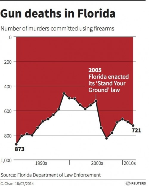
I glanced at that and thought, “Whoa, surprise: the stand-your-ground-laws had a pretty dramatic effect in reducing murder. I did not expect that at all.”
And then I was a bit disappointed: “But they really should have set the Y axis at zero. It’s a bit misleading and magnifies the apparent effect, otherwise.”
And then I did a double-take: “They inverted the freaking Y axis!”
more
http://freethoughtblogs.com/pharyngula/2014/04/15/thats-a-terrible-chart/
 = new reply since forum marked as read
Highlight:
NoneDon't highlight anything
5 newestHighlight 5 most recent replies
= new reply since forum marked as read
Highlight:
NoneDon't highlight anything
5 newestHighlight 5 most recent replies

Proud Public Servant
(2,097 posts)Even by the standards of right-wing gun nuts.
truebluegreen
(9,033 posts)making it look like gun deaths fell when actually they soared, reversing a falling trend.
I am tired of saying "Inconceivable!"...with these people the word has become meaningless.
That has to be one of the worst charts I've ever seen. It completely misrepresents the data.

LondonReign2
(5,213 posts)
Stargazer09
(2,132 posts)Pretty disgusting. But considering how important guns are to people like that, I am not surprised.
LondonReign2
(5,213 posts)how not to present your data. That is not an error, or poorly thought out, it is data presented in a manner that effectively executes its purpose -- to deceive.
Doctor_J
(36,392 posts)and, the next day, half of America will believe the opposite of what's true

Tommy_Carcetti
(43,181 posts)I admit, I was duped as well.
Whose chart was that?

siligut
(12,272 posts)For the statistics but certainly for not this purposely misleading graph.

Skinner
(63,645 posts)...she inverted the chart to make it look like dripping blood. She claims she wasn't trying to deceive. Click the tweet to see an Iraq graphic that was her inspiration:
https://twitter.com/ChristineHHChan/status/455971685783441408
https://twitter.com/ChristineHHChan

Ms. Toad
(34,069 posts)The chart which inspired hers is clear - by the title, if nothing else: "Iraq's Bloody Toll." Not to mention that with its more refined view along the x-axis the bars more closely resemble blood because there are so many discrete drips.
Really bad implementation of a fairly good idea.
ETA: Ooooh....scary....by her Twitter description she apparently does this for a living.

FSogol
(45,484 posts)
Ms. Toad
(34,069 posts)it is just her execution that is really lousy.

rrneck
(17,671 posts)

WhaTHellsgoingonhere
(5,252 posts)
JoeyT
(6,785 posts)that have different meanings at the top. Are we looking at gun deaths or murders? Gun deaths include legal self defense and usually suicide. Murders don't.
I'm guessing it's probably either gun deaths or a hybrid of the two - If it was murder, the rate would've dropped precipitously once they legalized murder. So it's probably all gun deaths excluding suicide.