General Discussion
Related: Editorials & Other Articles, Issue Forums, Alliance Forums, Region ForumsFour charts: GDP, employment, industrial production and real personal income less transfer payments.
by CalculatedRisk
By request, here is an update to four key indicators used by the NBER for business cycle dating: GDP, Employment, Industrial production and real personal income less transfer payments.
<...>
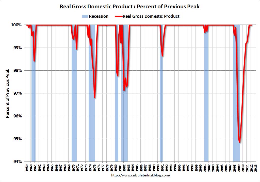
This graph is for real GDP through Q1 2012. Real GDP returned to the pre-recession peak in Q3 2011, and has been at new post recession highs for three consecutive quarters.
At the worst point, real GDP was off 5.1% from the 2007 peak.
<...>

This measure was off 10.7% at the trough.
Real personal income less transfer payments is still 4.2% below the previous peak.
<...>

Industrial production was off over 17% at the trough, and has been one of the stronger performing sectors during the recovery.
However industrial production is still 4.1% below the pre-recession peak.
<...>

Payroll employment is still 3.8% below the pre-recession peak.
All of these indicators collapsed in 2008 and early 2009, and only real GDP is back to the pre-recession peak. It is possible that industrial production will be back to the pre-recession peak in early 2013, but employment and personal income less transfer payments have a long way to go.
http://www.calculatedriskblog.com/2012/04/recovery-measures.html
 = new reply since forum marked as read
Highlight:
NoneDon't highlight anything
5 newestHighlight 5 most recent replies
= new reply since forum marked as read
Highlight:
NoneDon't highlight anything
5 newestHighlight 5 most recent replies

Uncle Joe
(58,355 posts)Thanks for the thread, ProSense.

ProSense
(116,464 posts)
cthulu2016
(10,960 posts)GDP and the stock market are back to nominal pre-crash territory (though the loss of time still equals a loss) but the crash was an opportunity to wring wage expectations out of the economy, to wring jobs out of the economy (permanently in may cases -- see elasticity, etc. Minimum unemployment, aka full employment, may be up to 5% unemployment now) and general take bites out of the real people that will never be made up.
No blame here, it's just what it is. Capitalism is pretty much done with the American people. It's just a looting operation for as long as it lasts.
ProSense
(116,464 posts)charts show is the devastating nature of this crisis and the huge hole across every indicator. When the economy suffers such devastation, climbing out of the huge hole is a monumental task, one made more difficult by Republicans and corporate saboteurs.
cthulu2016
(10,960 posts)any chart will show the magnitude of the crisis.
What these charts in particular show is the disonnect between GDP and the things that are expected to follow from GDP, like wages and employment.
A point of GDP today does not produce the same number of jobs and same amount of wages that point of GDP produced previously.
That is significant.
And yes, of course, Republicans have contributed to that deformation in the nature of the domestic economy.
Liberal_Stalwart71
(20,450 posts)ProSense
(116,464 posts)mention Reagan for the head-exploding effect: http://www.democraticunderground.com/1002599426