Welcome to DU!
The truly grassroots left-of-center political community where regular people, not algorithms, drive the discussions and set the standards.
Join the community:
Create a free account
Support DU (and get rid of ads!):
Become a Star Member
Latest Breaking News
General Discussion
The DU Lounge
All Forums
Issue Forums
Culture Forums
Alliance Forums
Region Forums
Support Forums
Help & Search
It's the Inequality, Stupid - Eleven charts that explain what's wrong with America.
http://motherjones.com/politics/2011/02/income-inequality-in-america-chart-graphHOW RICH ARE THE SUPERRICH?
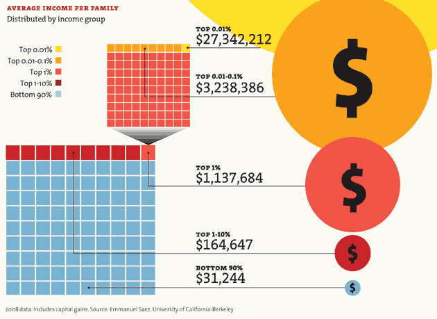
A huge share of the nation's economic growth over the past 30 years has gone to the top one-hundredth of one percent, who now make an average of $27 million per household. The average income for the bottom 90 percent of us? $31,244.
Note: The 2007 data (the most current) doesn't reflect the impact of the housing market crash. In 2007, the bottom 60% of Americans had 65% of their net worth tied up in their homes. The top 1%, in contrast, had just 10%. The housing crisis has no doubt further swelled the share of total net worth held by the superrich.
WINNERS TAKE ALL
The superrich have grabbed the bulk of the past three decades' gains.

InfoView thread info, including edit history
TrashPut this thread in your Trash Can (My DU » Trash Can)
BookmarkAdd this thread to your Bookmarks (My DU » Bookmarks)
16 replies, 4533 views
ShareGet links to this post and/or share on social media
AlertAlert this post for a rule violation
PowersThere are no powers you can use on this post
EditCannot edit other people's posts
ReplyReply to this post
EditCannot edit other people's posts
Rec (47)
ReplyReply to this post
16 replies
 = new reply since forum marked as read
Highlight:
NoneDon't highlight anything
5 newestHighlight 5 most recent replies
= new reply since forum marked as read
Highlight:
NoneDon't highlight anything
5 newestHighlight 5 most recent replies
= new reply since forum marked as read
Highlight:
NoneDon't highlight anything
5 newestHighlight 5 most recent replies
It's the Inequality, Stupid - Eleven charts that explain what's wrong with America. (Original Post)
xchrom
Jan 2012
OP
Smarmie Doofus
(14,498 posts)1. Good stuff there. Kicked, recommended and bookmarked.
Happy New Year and keep this board rockin' w. your great posts.

xchrom
(108,903 posts)2. Oh well, that was very nice. Thank you. Nt

Stuart G
(38,421 posts)4. K and R..outstanding...nt

aaaaaa5a
(4,667 posts)5. Outstanding info. I am going to show this to my parents.
Threads like this are what DU should be about.
REC

NJCher
(35,662 posts)6. thanks--that just inspired an assignment
I teach speech communication. My college students are inclined to rush through their charts and what's worse, even look at them while they are speaking to the audience.
I will have them use these charts to learn how to explain a chart or graph; they will then have to explain it to the audience without turning around and looking at it. In other words, full-face to the audience.

Cher
xchrom
(108,903 posts)7. great assignment. nt

Little Star
(17,055 posts)8. k&r

Tumbulu
(6,278 posts)9. Lots of interesting charts- way at the bottom one can see that
the only lower paid group than farmers and ranchers are airline pilots.......But of course executives are on the top.

Great Link. A must see / copy and distribute.

PuffedMica
(1,061 posts)11. Good reason to have a steep, progressive income tax rate
A little equality in income distribution would do this country good.

rury
(1,021 posts)12. K&R 400 million times!!!!

DirkGently
(12,151 posts)13. Nice.

OmahaBlueDog
(10,000 posts)14. K to the R


toddaa
(2,518 posts)15. xkcd has a better chart explaining exactly where you stand in comparison to the 1%

Solly Mack
(90,764 posts)16. K&R