The DU Lounge
Related: Culture Forums, Support ForumsHelp! What are the best colors for a Rainbow Peace Flag?
The Rainbow Peace Flag originated in Italy in 1961. The most common colors are these:

https://www.crwflags.com/fotw/flags/it%7Dpace.html
The Rainbow Peace Flag has seven stripes (the much newer Gay Rainbow Flag has six in reversed order and no text). There are many other color combinations used in variant Peace Flags:

I have looked for the real rainbow and prism colors, but are just getting more confused:

Ideally I am reaching for a mix between the prism colors and the traditional colors. And are hoping some sharp DU eyes here could give a nice artistic suggestion!
What should/could the best colors for a Rainbow Peace Flag be?
krispos42
(49,445 posts)Note: I have very little artistic talent or ability. ![]()
lapucelle
(18,252 posts)
TomVilmer
(1,832 posts)- but it is a bit to earth colored for my taste.
lapucelle
(18,252 posts)so thanks for humoring a Doctor Who fan. (The colors are from a scarf knitting pattern.)
Happy Thanksgiving!
![]()
TomVilmer
(1,832 posts)... I followed him as The Doctor when I lived in the UK. Thanks for the extra effort with the Pantone color markers.
lapucelle
(18,252 posts)Doctor Thirteen's tip of the hat...

Donkees
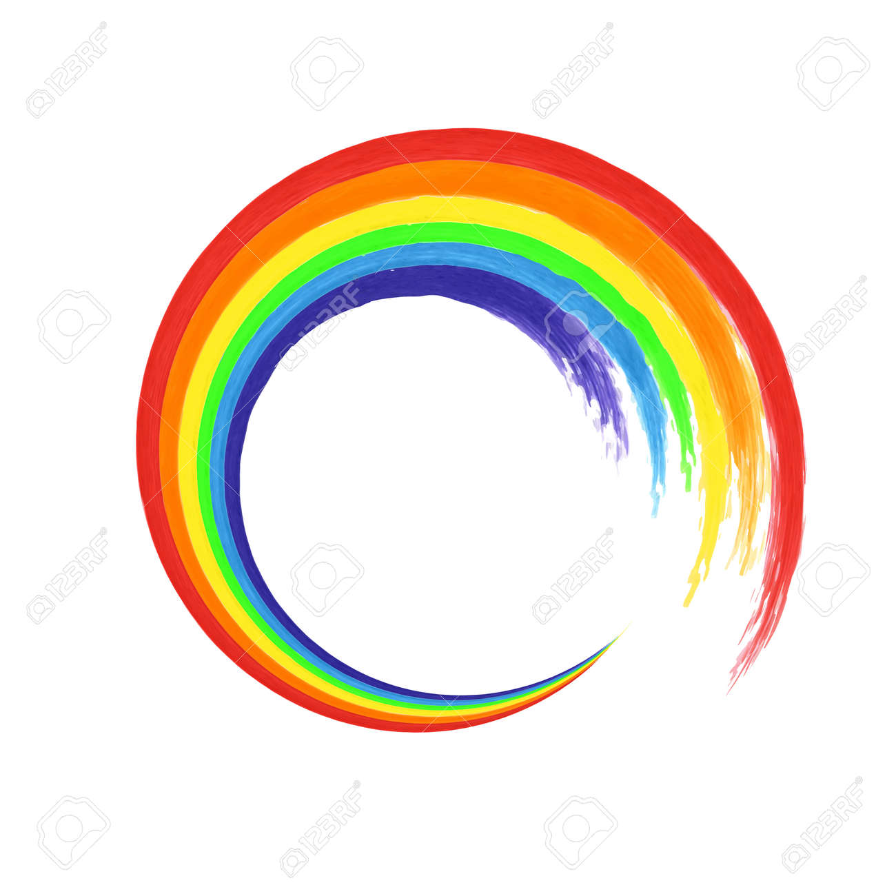
(31,405 posts)Peace symbolism would be circular, such as the Enso representing the circle of life, connectedness, harmony (full description below). In this critical time of earth history, a rainbow enso would would symbolize the heart of the message, rather than stripes.


At first glance the ancient ensō symbol appears to be nothing more than a miss-shaped circle but its symbolism refers to the beginning and end of all things, the circle of life and the connectedness of existence.
It also represents the oneness of life and all things contained within it, the spirit of harmonious cooperation, personal development and refinement of character, the visible and the invisible, absolute fullness in emptiness, simplicity, completeness, endlessness, perfect harmony, the circle of infinity and the cyclical nature of existence.
https://www.modernzen.org/enso/
TomVilmer
(1,832 posts)... but basically I was asked to recreate the Italian peace flag. I can adjust the colors, but not redo the design totally!
Donkees
(31,405 posts)which symbolizes peace, and the more intense colors would symbolize the intensity of energy and dedication required to achieve peace. The jewel-tones would also symbolize and honor the deeply-rooted earth-centered ancient traditions of living in harmony with all of nature.
TomVilmer
(1,832 posts)
Donkees
(31,405 posts)The Center Olive Peace Color would be the blending point of the cool and warm colors ![]()
 #1
#1
 #2
#2
 #3
#3
 #4
#4
 #5
#5
 #6
#6
 #7
#7
Thank you for playing with this. This image has your earth colors, two slightly different prisms and the basic Italian colors:

I like your earth vision, but can we make a mix in between. More light in each end etc?
Donkees
(31,405 posts)Yes, this is just a preliminary idea. It depends if anyone is interested in ''olive green'' as the center peace symbol, then the other color choices have to coordinate and give the impression of blending together visually. It seems the 'earth colors' are closer to 'prism 1' because there are teals and turquoise.
If the 'olive green' is *not* important to them, and you want something closer to 'Prism 2' I'll look at the chart again ![]()
TomVilmer
(1,832 posts)... but my sense of arts and color stuff is no good. And in a few days from now I should order some hundreds of these flags from a factory. But it is hard to make a decision, since I would like a mix between the real rainbow, and those existing flags.
And it looks like you know much more about colors than me, so any help is appreciated ![]() . I look forward to post a picture of the real flag, when it comes!
. I look forward to post a picture of the real flag, when it comes!
Donkees
(31,405 posts)you want? I'm trying to match Prism2


Donkees
(31,405 posts)


-
TomVilmer
(1,832 posts)Now you are really getting close ![]() . I am wondering if this is harmonic and gradually switching between the seven colors. Your version seems more harmonic than the original does.
. I am wondering if this is harmonic and gradually switching between the seven colors. Your version seems more harmonic than the original does.
Around on the net there are palette tools. Since I am no artist, I have looked there, fx:
https://labs.tineye.com/color/8fe3eb56234afea91726e6331d6a6e887cf6818b?ignore_background=True&width=52&color_format=hex&ignore_interior_background=True&height=250
Donkees
(31,405 posts)by not *too* much blending the edges, like a real prism would be, because I really wasn't sure that was your aim for the flag. Using these color choices, I'll try a more blended look next.
TomVilmer
(1,832 posts)Donkees
(31,405 posts)


-----


TomVilmer
(1,832 posts)
- unless you have some more pixie dust to add, I will now test it with my friends.
Donkees
(31,405 posts)It looks better than I imagined, but there's time this week-end to fine-tune it if you decide ![]()
TomVilmer
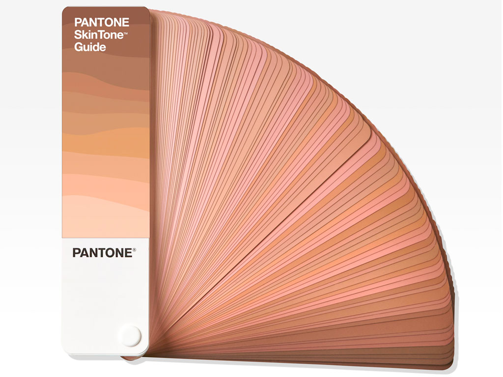
(1,832 posts)The skin tone post reminded me, that next stop is to jump from web to print. I then tried to put your colors in a wizard for Pantone colors - a new challenge!
https://www.ginifab.com/feeds/pms/pms_color_in_image.php

Donkees
(31,405 posts)I got the RBG numbers from the https://www.colorhexa.com site, then entered them here: https://www.pantone.com/color-finder#/convert?pantoneBook=all
I got these seven codes and color samples:
https://www.pantone.com/color-finder/2355-XGC
https://www.pantone.com/color-finder/2090-C
https://www.pantone.com/color-finder/333-UP
https://www.pantone.com/color-finder/2426-UP
https://www.pantone.com/color-finder/114-XGC
https://www.pantone.com/color-finder/17-1463-TPG
https://www.pantone.com/color-finder/20-0061-TPM
Donkees
(31,405 posts)259C
2090C
2248C
7740C or 7741C
114C
171C? or 179C?
485C
TomVilmer
(1,832 posts)Following your valuable input, I tried to find the "simplest" colors, and they seems to be able to fit mostly in the Pantone C palette with short numbers - with one exemption in the middle. How do you see these suggestions in column two her, where at least number 1 and the missing number 4 still needs some thinking. (6 and 7 are switched wrong):

Number 4 could be this
https://www.pantone.com/color-finder/555-C
Donkees
(31,405 posts)I found on another chart is this:
https://www.pantone.com/color-finder/7730-C
I'm going to look at the purple again in the new chart I found.
TomVilmer
(1,832 posts)Not quite there, but how about these?

Donkees
(31,405 posts)It's difficult to find a close match to the green using limited number codes, but you came closest, so try that darker one you chose and see how it looks together
TomVilmer
(1,832 posts)... which might look very different when printing on polyester. So much to learn, but let's stick with the C for now, and let the people at the print shop advice me later. As far my tire eyes can see, we are now down to mostly adjusting the green color number 4, which still is a bit off. Might need to be lighter:


Donkees
(31,405 posts)Maybe this slightly brighter purple? https://www.pantone.com/color-finder/249-C ![]()


TomVilmer
(1,832 posts)You also found a nice green there - is it a Pantone XXX C?

Donkees
(31,405 posts)I wasn't sure if you were keeping the dark #555. I'll try to find a better easier pantone chart that I can use to find a low number green.
https://www.pantone.com/color-finder/P-143-13-C
https://www.pantone.com/color-finder/7730-C
TomVilmer
(1,832 posts)Temporary - and restricted to the low numbers!
http://porten.dk/.PantoneC.html
Donkees
(31,405 posts)Donkees
(31,405 posts)TomVilmer
(1,832 posts)
Maybe this is the winner?

Donkees
(31,405 posts)
TomVilmer
(1,832 posts)I started this project a month ago, and I think your good help got me past the finish line. I hope the others back here will enjoy it also, so we can make it in to reality. Thanks ![]() .
.
Donkees
(31,405 posts)lapucelle
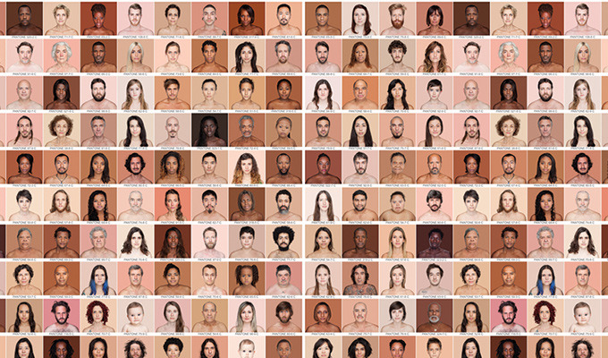
(18,252 posts)...I'd like to see a rainbow flag of skin tones.


TomVilmer
(1,832 posts)... and I do not see my own skin color in that Pantone set ![]() .
.
lapucelle
(18,252 posts)