Photography
Related: About this forumcriticism wanted
im playing around with some b/w. what do you think of this shot. feel free to be critical,thats what i want
[url=http://www.flickr.com/photos/rdking647/7058906183/][img]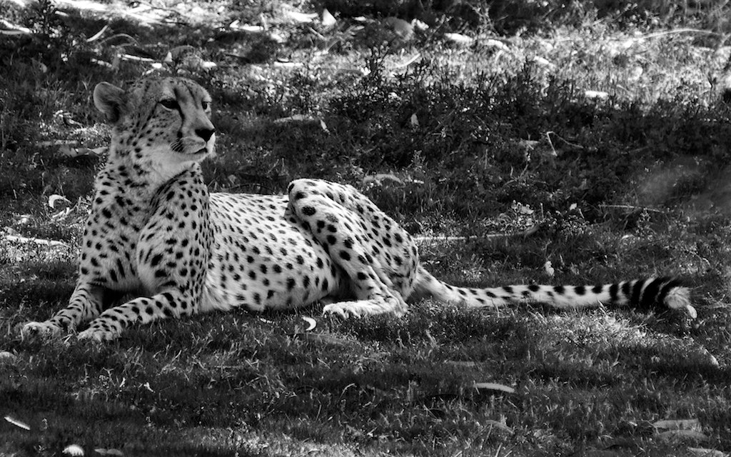 [/img][/url]
[url=http://www.flickr.com/photos/rdking647/7058906183/]DSC_6782[/url] by [url=http://www.flickr.com/people/rdking647/]rdking647[/url], on Flickr
 = new reply since forum marked as read
Highlight:
NoneDon't highlight anything
5 newestHighlight 5 most recent replies
= new reply since forum marked as read
Highlight:
NoneDon't highlight anything
5 newestHighlight 5 most recent replies

alfredo
(60,077 posts)I really like the sharpness of the cat. You nailed the focus. The blacks of the dots are nice and deep. You can almost see the cat breathing.
There seems to be a whisper of blue in the picture. It's almost like a still from a black and white movie.

handmade34
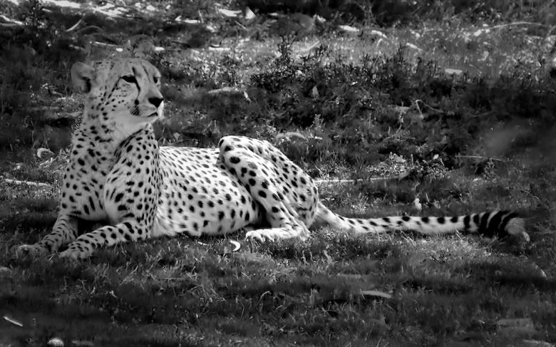
(22,758 posts)I like your photo and think the potential problem is lighting... and the blurring of the cat into the background... it is a fun photo to play with and I altered it merely according to my preferences, not because I think it is better... I cropped it and altered the contrast and brightness... (it was fun manipulating it so that there was an obvious intentional melding of the cat into the background- didn't save that one)

alfredo
(60,077 posts)handmade34
(22,758 posts)allows for a better focus on the cat without the distraction of the nebulous background... I don't have much of a program to work with, just my Windows Photo Gallery... I merely heightened the temperature (color)... not necessarily for a sepia effect but thats what happened...
alfredo
(60,077 posts)Bringing out detail, and taking the bite out of troublesome highlights.
nadinbrzezinski
(154,021 posts)Focus on your subject, and take out the distractions.
Sunday I was told in good criticism that I tend not to bring enough focus to my subjects, aka people.
Ah skill frill, no zoom today, not much of a zoom that is.

Richard D
(8,803 posts)Did some tone adjustment, selective dodging and burning and blurred the background.


ManiacJoe
(10,136 posts)As Alfredo points out in post #1, the cat blends in with the background a bit too well in th original. Otherwise, great shot, rdking647.
nadinbrzezinski
(154,021 posts)SInce it looks "grainy" unless that was the effect you were looking for.
Taking new toy out with almost 35mm focal, it's the kit lense, and monochrome.
Going for a skill drill.
You will be able to critique me as well.

Celebration
(15,812 posts)I lightened part of the face, added just a slight vignette effect, slight black effect and some overall lightening. I think I like Richard's better though, and maybe yours as well. The main thing is that you need to set the animal apart from the background. I'm on the fence about correcting for the shadows on the leopard. If I were to do this again I think I would have the face halfway between yours and mine.
I love using the vignette, though, where it is barely noticeable. I also used something called "luminescence"--just a bit, though.
rdking647
(5,113 posts)lightened the head some and sharpened
[url=http://www.flickr.com/photos/rdking647/7061995333/][img] [/img][/url]
[url=http://www.flickr.com/photos/rdking647/7061995333/]edited jaguar[/url] by [url=http://www.flickr.com/people/rdking647/]rdking647[/url], on Flickr
handmade34
(22,758 posts)nadinbrzezinski
(154,021 posts)