Populist Reform of the Democratic Party
In reply to the discussion: Progressives: Weve Never Heard Of This Progressive Group Backing Obamas Trade Deal [View all]Dragonfli
(10,622 posts)It doesn't make sense unless it was designed by a libertarian. For one thing, it appears that they use social issues and nothing else to determine the right left axis, also, the poles on top or bottom don't appear to me to make any sense at all.
It is nothing like the more valid graphs used to objectively measure political leanings, it appears to be just propaganda.
We need to find out who designed it, to what purpose, and why it is used specifically for Hillary Clintron in order to spoof the similar graphs that once were used to legitimately place people on the right left spectrum.
I suspect it was designed deliberately to mislead. I would like us all to try to discover it's origin, it's methodology and what faux progressive or astro turf group is responsible for it.
It is obviously bullshit, and I would like it to be answered every time it appears succinctly, with facts, as to why it is bullshit and who is behind it.
Just compare it to the chart usually used, one that is/was used before I ever saw the one that places Clinton inexplicably far left.
https://www.politicalcompass.org/uselection2008
Some example graphics taken from the page I linked above.
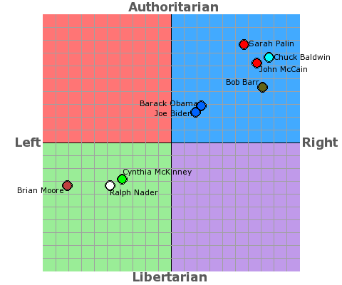
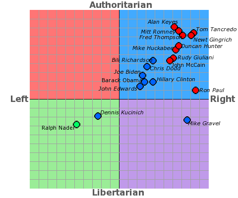
As you can see, when not using a fake chart and methodology, one can see a more realistic placement of Hillary Clinton.
Knowing or sensing it is bullshit is one thing, shoving the lie in their faces with truth and an explanation as to how, why, and by whom the misinformation is spread woul,d be to expose a scam that has become of critical importance the more Vannila and friends use it to lie and the uninformed that just take the lie at face value because it looks to them like valid charts they have seen before.
We have clever people here, lets completely unmask this bit of propaganda for all to see evey time they pull it out of their third way trickster bag!
Edit history
 = new reply since forum marked as read
Highlight:
NoneDon't highlight anything
5 newestHighlight 5 most recent replies
RecommendedHighlight replies with 5 or more recommendations
= new reply since forum marked as read
Highlight:
NoneDon't highlight anything
5 newestHighlight 5 most recent replies
RecommendedHighlight replies with 5 or more recommendations